Tableau Dual Axis
Tableau Dual Axis is very useful to compare Sales Amount data with total product cost or to compare Sales against profits etc. In this article we will show you, How to Create Dual Axis reports in Tableau with example. For this we are going to use the Data Source we created in our previous article so, Please visit Data Labels in Tableau Reports article to understand the Data Source.
You can compare multiple measures using dual axes, which are two independent axes that are layered on top of each other.
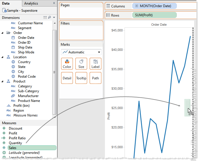
Dual axes are useful when you have two measures that have different scales. To add a measure as a dual axis, drag the field to the right side of the view and drop it when you see a black dashed line appear. You can also right-click (control-click on Mac) the measure on the Columns or Rows shelf and select Dual Axis.
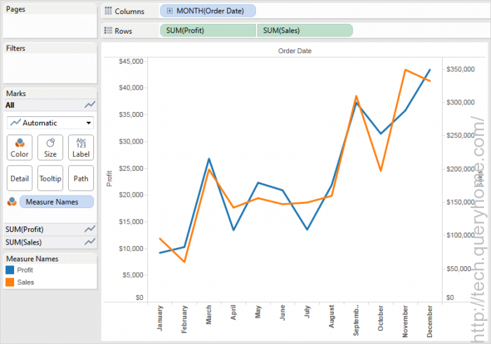
The result is a dual axis view where the Profit axis corresponds to the blue line and the Sales axis corresponds to the orange line.
You can add up to four layered axes: two on the Columns shelf and two on the Rows shelf.
Synchronize Axes
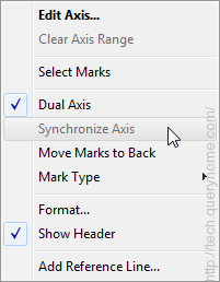
To align the two axes in a dual axis to have the same scale, right-click (control-click on Mac) the secondary axis, and select Synchronize Axis. This aligns the scale of the secondary axis to the scale of the primary axis
In this example, the Sales axis is the secondary axis and the Profit axis is the primary axis.
Note: To synchronize axes, the data types for both measures must be the same. If the data types for your measures are different, see the section below.
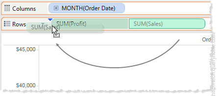
If you would like to change which axis is the primary, and which axis is the secondary, select the field on the Columns or Rows shelf that is the secondary, and drag it in front of the primary field on the shelf until you see a blue triangle appear.
In this example, you can select the SUM(Sales) field on the Rows shelf, and drag it in front of the SUM(Profit) field. The Sales axis is now the primary and the Profit axis is the secondary.
Synchronizing axes with measures that are different data types
The Synchronize Axis option ensures that you make a scaled and correct comparison. However, sometimes this option may not be available (grayed out). This is because the data type of one of the axes is different from the other.
To resolve this issue, you must change the data type of one of the axes. To follow along, use the Superstore workbook.
Right-click in the Data pane and select Create Calculated Field.
Create a calculated field that changes the data type of a measure, like in one of the following examples:
float ([Number of Records])
or
Int ([Profit])
Replace the measure on the view with the appropriate calculation you created in step 2.
Right click the secondary axis, and then select Synchronize Axis. The option is now available.