top button
Flag Notify
    Connect to us
      Site Registration

Site Registration

how to use XAML GroupBox in WPF and Windows phone application?

+4 votes
571 views

The GroupBox element in XAML is used to add a header to an area and within that area you can place controls. By default, a GroupBox can have one child but multiple child controls can be added by placing a container control on a GroupBox such as a Grid or StackPanel.

How to create a GroupBox in WPF and Windows phone application,.

The GroupBox element in XAML represents a GroupBox control. The following code snippet creates a GroupBox control and sets its background and font. The code also sets the header using GroupBox.Header. 

  1. <Window x:Class="GroupBoxSample.Window1"  
  2.     xmlns="http://schemas.microsoft.com/winfx/2006/xaml/presentation"  
  3.     xmlns:x="http://schemas.microsoft.com/winfx/2006/xaml"  
  4.     Title="Window1" Height="300" Width="300">  
  5.     <Grid>  
  6.         <GroupBox Margin="10,10,10,10" FontSize="16" FontWeight="Bold"  
  7.                   Background="LightGray">  
  8.             <GroupBox.Header>                  
  9.                Mindcracker Network  
  10.             </GroupBox.Header>   
  11.               
  12.             <TextBlock FontSize="12" FontWeight="Regular">  
  13.                 This is a group box control content.                  
  14.             </TextBlock>               
  15.            
  16.         </GroupBox>  
  17.   
  18.     </Grid>  
  19. </Window>  

The output looks like this.

posted Nov 12, 2015 by Jdk

  Promote This Article
Facebook Share Button Twitter Share Button LinkedIn Share Button


Related Articles

Introduction 

The RichTextBox control allows you to view and edit text, paragraph, images, tables and other rich text format contents. 

The RichTextBox tag represents a RichTextBox control in XAML. 

<RichTextBox></RichTextBox>  

The Width and Height properties represent the width and the height of a RichTextBox. The Name property represents the name of the control, that is a unique identifier of a control. The Margin property tells the location of a RichTextBox on the parent control. The HorizontalAlignment andVerticalAlignment properties are used to set horizontal and vertical alignments. 

The following code snippet sets the name, height and width of a RichTextBox control. The code also sets the horizontal alignment to left and the vertical alignment to top. 

<RichTextBox Margin="10,10,0,13" Name="RichTextBox1" HorizontalAlignment="Left"   

                 VerticalAlignment="Top" Width="500" Height="300" />  

Displaying and Edit Text 

RichTextBox control hosts a collection of RichTextBoxItem. The following code snippet adds items to a RichTextBox control.


<RichTextBox Margin="10,10,0,13" Name="RichTextBox1" HorizontalAlignment="Left"   
             VerticalAlignment="Top" Width="500" Height="300">  
    <FlowDocument>  
        <Paragraph>  
            I am a flow document. Would you like to edit me?  
            <Bold>Go ahead.</Bold>                  
        </Paragraph>  
        
        <Paragraph Foreground="Blue">            
            I am blue I am blue I am blue.    
        </Paragraph>  
    </FlowDocument>          
</RichTextBox> 

The preceding code generates Figure 1 where you can begin editing text right away.

RichTextBox with editable text

Creating and Using RichTectBox Dynamically 

In the previous section, we saw how to create and use a RichTextBox in XAML. WPF provides the RichTextBox class that represents a RichTextBox control. In this section, we will see how to use this class to create and use a RichTextBox control dynamically. 

The code listed in Listing 1 creates a FlowDocument, adds a paragraph to the flow document and sets the Document property of the RichTextBox to FlowDocument.


private void CreateAndLoadRichTextBox()  
{  
    // Create a FlowDocument  
    FlowDocument mcFlowDoc = new FlowDocument();  
  
    // Create a paragraph with text  
    Paragraph para = new Paragraph();  
    para.Inlines.Add(new Run("I am a flow document. Would you like to edit me? "));  
    para.Inlines.Add(new Bold(new Run("Go ahead.")));  
  
    // Add the paragraph to blocks of paragraph  
    mcFlowDoc.Blocks.Add(para);  
  
    // Create RichTextBox, set its hegith and width  
    RichTextBox mcRTB = new RichTextBox();  
    mcRTB.Width = 560;  
    mcRTB.Height = 280;  
  
    // Set contents  
    mcRTB.Document = mcFlowDoc;  
  
    // Add RichTextbox to the container  
    ContainerPanel.Children.Add(mcRTB);       
}  

Listing 1

The output of Listing 1 generates Figure 2.

Listing 1 doc

Enable Spelling Check 

RichTextBox control comes with spell check functionality out-of-the-box. By setting theSpellCheck.IsEnabled property to true enables spell checking in a RichTextBox

SpellCheck.IsEnabled="True"  

You can set this in code as follows:

mcRTB.SpellCheck.IsEnabled = true;  

Now if you type some text, the wrong word would be underlined with the Red color. See in Figure 3.

RichTextBox with Spell Check Enabled


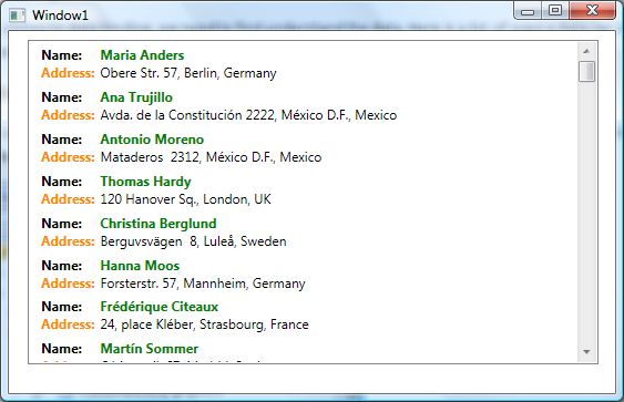
Loading a Document in RichTextBox
We can use the RichTextBox.Items.Remove or RichTextBox.Items.RemoveAt methods to delete an item from the collection of items in the RichTextBox. The RemoveAt method takes the index of the item in the collection. 
Now, we modify our application and add a new button called Delete Item. The XAML code for this button looks as in the following:  

private void LoadTextDocument(string fileName)  
{  
    TextRange range;  
    System.IO.FileStream fStream;  
    if (System.IO.File.Exists(fileName))  
    {  
        range = new TextRange(RichTextBox1.Document.ContentStart, RichTextBox1.Document.ContentEnd);  
        fStream = new System.IO.FileStream(fileName, System.IO.FileMode.OpenOrCreate);  
        range.Load(fStream, System.Windows.DataFormats.Text );  
        fStream.Close();  
    }  
}

READ MORE

The XAML Tooltip element represents a window tooltip. A ToolTip is a pop-up window that displays some information in a small window. This article shows how to use a ToolTip control in WPF.

Creating a ToolTip

The ToolTip element represents a ToolTip control in XAML

<ToolTip/>  

The IsOpen property indicates whether or not a ToolTip is visible. The HorizontalOffset and VerticalOffsetproperties represent the horizontal and vertical distance between the target control and the pop-up window. The Content property represents the contents of the ToolTip. 

The code snippet in Listing 1 creates a ToolTip control and sets the horizontal offset, vertical offset and content of a ToolTip control. 


<ToolTip Content="Hello! I am a ToolTip."   
HorizontalOffset="10" VerticalOffset="20"/> 

                                                            Listing 1

The output looks as in Figure 1. 

                                              Creating a ToolTip
                                       

ToolTip Service

To display a tooltip for a control, the ToolTipService class must be used. The SetToolTip and GetToolTipstatic methods are used to set and get the tooltip of a control. 

The following code snippet creates a ToolTipService.ToolTip for a control.


<ToolTipService.ToolTip >   
    <ToolTip Content="Hello! I am a ToolTip."   
    HorizontalOffset="10" VerticalOffset="20"/>  
</ToolTipService.ToolTip>   


 <Button Content="Mouse over me" Width="150" Height="30"  
        Canvas.Top="10" Canvas.Left="10">  
    <ToolTipService.ToolTip >   
        <ToolTip Content="Hello! I am a ToolTip."   
        HorizontalOffset="10" VerticalOffset="20"/>  
    </ToolTipService.ToolTip>  
</Button>                                            


Then if you run the application and hover the mouse over the button control, the output looks as in Figure 2.

                                    ToolTip Service
                                                       

Creating a Fancy Tooltip

The ToolTip content can be any control and multiple controls. The code snippet in Listing 4 creates aToolTip with an image and text in it. 

          <!-- Create a button -->  
<Button Content="Mouse over me" Width="150" Height="30"   
        Canvas.Top="50" Canvas.Left="20">  
    <!-- Create a tooltip by using the ToolTipService -->  
    <ToolTipService.ToolTip >  
        <ToolTip HorizontalOffset="0" VerticalOffset="0">  
            <!-- Add a StackPanel to the tooltip content -->  
            <StackPanel Width="250" Height="150">  
                <!-- Add an image -->  
                <StackPanel.Background>  
                    <ImageBrush ImageSource="Garden.jpg"  
                                Opacity="0.4"/>  
                </StackPanel.Background>  
                <!-- Add a text block -->  
                <TextBlock >  
                    <Run Text="This is a tooltip with an image and text"  
                        FontFamily="Georgia" FontSize="14" Foreground="Blue"/>  
                </TextBlock>  
            </StackPanel>  
        </ToolTip>  
    </ToolTipService.ToolTip>  
</Button>                                       


The new tooltip looks as :

                  Creating a Fancy Tooltip


READ MORE

The XAML Toolbar element represents a window toolbar. A ToolBar control is a group of controls that are typically related in functionality. A typical ToolBar is a toolbar in Microsoft Word and Visual Studio where you see File Open, Save and Print buttons. 

This article discusses basic components of ToolBar controls in WPF and how to use them in your applications. 

Creating a Toolbar

The ToolBar element in XAML represents a WPF ToolBar control. 

<ToolBar />  
The code snippet in Listing 1 creates a ToolBar control and sets its width and height properties. You may place any control on a ToolBar but typically buttons are used. A ToolBar sits on a ToolBarTray. The code snippet in Listing 1 adds three buttons to the ToolBar and places a ToolBar on a ToolBarTray.
<ToolBarTray Background="DarkGray" Height="30" VerticalAlignment="Top">  
  
<ToolBar Name="MyToolbar" Width="200" Height="30" >  
    <Button Background="LightSkyBlue" Content="Open" />  
    <Button Background="LightSkyBlue" Content="Close" />  
    <Button Background="LightSkyBlue" Content="Exit" />  
</ToolBar>  
  
</ToolBarTray>  
                                                      Listing 1


The output looks as in Figure 1. 

         window
                                                      Figure 1

Adding ToolBar Button Click Event Handlers

The best part of WPF is that these buttons are WPF Button controls so you have a choice to use them on any other button. You may format them the way you like. You may add a click event handler to them and so on. 

The code snippet in Listing 2 adds click event handlers to all three ToolBar buttons. 
<ToolBar Name="MyToolbar" Width="200" Height="30"  >  
    <Button Background="LightSkyBlue" Content="Open" Name="OpenButton" Click="OpenButton_Click"  />  
    <Button Background="LightSkyBlue" Content="Close" Name="CloseButton" Click="CloseButton_Click"  />  
    <Button Background="LightSkyBlue" Content="Exit" Name="ExitButton" Click="ExitButton_Click"   />  
 </ToolBar>  
                                                      Listing 2

On these button click event handlers, you would want to write the code you want to execute when these buttons are clicked. For example, I show a message when these buttons are clicked. The code for these button click event handlers is as in Listing 3.
private void OpenButton_Click(object sender, RoutedEventArgs e)  
{  
    MessageBox.Show("Open button is clicked.");  
}  
  
private void CloseButton_Click(object sender, RoutedEventArgs e)  
{  
    MessageBox.Show("Close button is clicked.");  
}  
  
private void ExitButton_Click(object sender, RoutedEventArgs e)  
{  
    MessageBox.Show("Exit button is clicked.");  
}  
                                                      Listing 3

If you click on the Open button, you will see Figure 2 as output. 

                                    button
                                                      Figure 2

Adding Images to ToolBar Buttons 

Usually ToolBars look nicer than just displaying text. In most cases, they have icons. Displaying an Icon image on a button is simply placing an Image control as the content of a Button. The code snippet in Listing 4 changes the Button contents from text to images. 
<ToolBarTray Background="DarkGray" Height="30" VerticalAlignment="Top">  
    <ToolBar Name="MyToolbar" Width="200" Height="30" Background="LightCoral" >  
        <Button Name="OpenButton" Click="OpenButton_Click">  
            <Image Source="Images\camera.png" />  
         </Button>  
        <Button Name="CloseButton" Click="CloseButton_Click">  
            <Image Source="Images\ctv.png" />  
        </Button>  
        <Button Name="ExitButton" Click="ExitButton_Click" >  
            <Image Source="Images\find.png" />  
        </Button>  
    </ToolBar>  
</ToolBarTray>  
                                                      Listing 4

The new ToolBar looks as in Figure 3.

                    ToolBar
                                                      Figure 3

Adding Separators to a ToolBar

You may use a Separator control to give your ToolBar buttons a more prominent look. The code snippet in Listing 4 adds a few extra buttons and a few separators to a ToolBar.
<ToolBarTray Background="DarkGray" Height="30" VerticalAlignment="Top">  
    <ToolBar Name="MyToolbar" Width="180" Height="30" Background="LightCoral" >  
        <Separator />  
        <Button Name="OpenButton" Click="OpenButton_Click">  
            <Image Source="Images\camera.png" />  
         </Button>  
        <Button Name="CloseButton" Click="CloseButton_Click">  
            <Image Source="Images\ctv.png" />  
        </Button>  
        <Button Name="ExitButton" Click="ExitButton_Click" >  
            <Image Source="Images\find.png" />  
        </Button>  
        <Separator Background="Yellow" />  
        <Button >  
            <Image Source="Images\award.png" />  
        </Button>  
        <Button >  
            <Image Source="Images\cuser.png" />  
        </Button>  
        <Button >  
            <Image Source="Images\next.png" />  
        </Button>  
        <Button >  
            <Image Source="Images\code.png" />  
        </Button>  
        <Separator />  
    </ToolBar>  
</ToolBarTray>  
                                                      Listing 5

The ToolBar with separators looks as in Figure 4. Also, if you notice there is a drop array that is available when buttons do not fit in a ToolBar. If you click on that, you will see the rest of the buttons.

   
         fit in a ToolBar
                                                      Figure 4

Summary

In this article, I discussed how to use a ToolBar control in WPF and C#.

READ MORE

The XAML TextBlock element represents a text block. The TextBlock control provides a lightweight control for displaying small amounts of flow content. This article shows how to use a TextBlock control in WPF.

Creating a TextBlock

The TextBlock element represents a WPF TextBlock control in XAML. 

  1. <TextBlock/>  

The Width and Height attributes of the TextBlock element represent the width and the height of aTextBlock. The Text property of the TextBlock element represents the content of a TextBlock. The Name attribute represents the name of the control that is a unique identifier of a control. The Foreground property sets the foreground color of contents. This control does not have a Background property. 

The code snippet in Listing 1 creates a TextBlock control and sets the name, height, width, foreground and content of a TextBlock control. Unlike a TextBox control, the TextBlock does not have a default border around it.

<TextBlock Name="TextBlock1" Height="30" Width="200"   

    Text="Hello! I am a TextBlock." Foreground="Red">  

</TextBlock>  

Listing 1

The output looks as in Figure 1

                                          output
                                                      Figure 1

As you can see from Figure 1, by default the TextBlock is placed in the center of the page. We can place aTextBlock control where we want using the MarginVerticalAlignment and HorizontalAlignment attributes that sets the margin, vertical alignment and horizontal alignment of a control. 

The code snippet in Listing 2 sets the position of the TextBlock control in the left top corner of the page. 

<TextBlock Name="TextBlock1" Height="30" Width="200"   
        Text="Hello! I am a TextBlock."   
        Margin="10,10,0,0" VerticalAlignment="Top"   
        HorizontalAlignment="Left">              
</TextBlock>  ​

                                                      Listing 2

Creating a TextBlock Dynamically

The code listed in Listing 3 creates a TextBlock control programmatically. First, it creates a TextBlockobject and sets its width, height, contents and foreground and later the TextBlock is added to theLayoutRoot

private void CreateATextBlock()  
{  
    TextBlock txtBlock = new TextBlock();  
    txtBlock.Height = 50;  
    txtBlock.Width = 200;  
    txtBlock.Text = "Text Box content";  
    txtBlock.Foreground = new SolidColorBrush(Colors.Red);  
  
    LayoutRoot.Children.Add(txtBlock);  
} ​

                                                      Listing 3

Setting Fonts of TextBlock Contents

The FontSizeFontFamilyFontWeightFontStyle and FontStretch properties are used to set the font size, family, weight, style and stretch to the text of a TextBlock. The code snippet in Listing 4 sets the font properties of a TextBlock

  1. FontSize="14" FontFamily="Verdana" FontWeight="Bold"  

                                                      Listing 4

The new output looks as in Figure 4.

                                    hello

READ MORE

Data Binding with Controls

The last data binding type we will see is how to provide a data exchange between a ListBox and other controls using data binding in WPF.

We will create an application that looks as in Figure 12. In Figure 12, I have a ListBox with a list of colors, a TextBox and a Canvas. When we pick a color from the ListBox, the text of TextBox and color of Canvas changes dynamically to the color selected in the ListBox and this is possible to do all inXAML without writing a single line of code in the code behind file.

looks like Figure
                                                Figure 12.

The XAML code of the page looks as in following.

​       <StackPanel Orientation="Vertical">  
    <TextBlock Margin="10,10,10,10" FontWeight="Bold">  
        Pick a color from below list  
    </TextBlock>  
    <ListBox Name="mcListBox" Height="100" Width="100"  
             Margin="10,10,0,0" HorizontalAlignment="Left" >  
        <ListBoxItem>Orange</ListBoxItem>  
        <ListBoxItem>Green</ListBoxItem>  
        <ListBoxItem>Blue</ListBoxItem>  
        <ListBoxItem>Gray</ListBoxItem>  
        <ListBoxItem>LightGray</ListBoxItem>  
        <ListBoxItem>Red</ListBoxItem>  
    </ListBox>   
   <TextBox Height="23" Name="textBox1" Width="120" Margin="10,10,0,0" HorizontalAlignment="Left"  >  
        <TextBox.Text>  
            <Binding ElementName="mcListBox" Path="SelectedItem.Content"/>  
        </TextBox.Text>  
    </TextBox>  
    <Canvas Margin="10,10,0,0" Height="200" Width="200" HorizontalAlignment="Left" >  
        <Canvas.Background>  
            <Binding ElementName="mcListBox" Path="SelectedItem.Content"/>  
        </Canvas.Background>  
    </Canvas>  
</StackPanel>        

If you look at the TextBox XAML code, you will see the Binding within the TextBox.Text property that sets the binding from TextBox to another control and another control ID is ElementName and another control's property is Path. So in the following code, we are setting the SelectedItem.Content property ofListBox to the TextBox.Text property. 

 <TextBox.Text>  

   <Binding ElementName="mcListBox" Path="SelectedItem.Content"/>  
</TextBox.Text>  

Now the same applies to the Canvas.Background property, where we set it to theSelectedItem.Content of the ListBox. Now, every time you select an item in the ListBox, theTextBox.Text and Canvas.Background properties are set to that selected item in the ListBox.


<Canvas.Background>  
   <Binding ElementName="mcListBox" Path="SelectedItem.Content"/>  
</Canvas.Background> 

Summary

In this article, I explained how to create and use a ListBox control available in WPF and WP8. We saw how to add items to a ListBox, change item properties and add images add check boxes. In the end of this article, we saw how data binding works in ListBox and how to bind a ListBox with data coming from objects, databases and other controls. 

READ MORE

Now we add a ListBox control and set its ItemsSource property as the first DataTable of the DataSetand set ItemTemplate to the resource defined above. 

<ListBox Margin="17,8,15,26" Name="listBox1" ItemsSource="{Binding Tables[0]}"  ItemTemplate="{StaticResource listBoxTemplate}" />  

Now in our code behind, we define the following variables. 

public SqlConnection connection;  

public SqlCommand command;  

string sql = "SELECT ContactName, Address, City, Country FROM Customers"

string connectionString = @"Data Source=.\SQLEXPRESS;AttachDbFilename=|DataDirectory|\NORTHWND.MDF;Integrated Security=True;Connect Timeout=30;User Instance=True"

Now on the Windows_Loaded method, we call the BindData method and in the BindData method, we create a connection, data adapter and fill in the DataSet using the SqlDataAdapter.Fill() method.

private void Window_Loaded(object sender, RoutedEventArgs e)  
{  
    BindData();             
}  
  
private void BindData()  
{  
    DataSet dtSet = new DataSet();  
    using (connection = new SqlConnection(connectionString))  
    {  
        command = new SqlCommand(sql, connection);                 
        SqlDataAdapter adapter = new SqlDataAdapter();             
        connection.Open();  
        adapter.SelectCommand = command;  
        adapter.Fill(dtSet, "Customers");  
        listBox1.DataContext = dtSet;  
    }  
}  

Data Binding with XML 

Now let's look at how to bind XML data to a ListBox control. The XmlDataProvider is used to bind XMLdata in WPF

Here is an XmlDataProvider defined in XAML that contains books data. The XML data is defined within the x:Data tag. 


<XmlDataProvider x:Key="BooksData" XPath="Inventory/Books">  
    <x:XData>  
        <Inventory xmlns="">  
            <Books>  
                <Book Category="Programming" >  
                    <Title>A Programmer's Guide to ADO.NET</Title>  
                    <Summary>Learn how to write database applications using ADO.NET and C#.  
                    </Summary>  
                    <Author>Mahesh Chand</Author>  
                    <Publisher>APress</Publisher>  
                </Book>  
                <Book Category="Programming" >  
                    <Title>Graphics Programming with GDI+</Title>  
                    <Summary>Learn how to write graphics applications using GDI+ and C#.  
                    </Summary>  
                    <Author>Mahesh Chand</Author>  
                    <Publisher>Addison Wesley</Publisher>  
                </Book>  
                <Book Category="Programming" >  
                    <Title>Visual C#</Title>  
                    <Summary>Learn how to write C# applications.  
                    </Summary>  
                    <Author>Mike Gold</Author>  
                    <Publisher>APress</Publisher>  
                </Book>  
                <Book Category="Programming" >  
                    <Title>Introducing Microsoft .NET</Title>  
                    <Summary>Programming .NET  
                    </Summary>  
                    <Author>Mathew Cochran</Author>  
                    <Publisher>APress</Publisher>  
                </Book>  
                <Book Category="Database" >  
                    <Title>DBA Express</Title>  
                    <Summary>DBA's Handbook  
                    </Summary>  
                    <Author>Mahesh Chand</Author>  
                    <Publisher>Microsoft</Publisher>  
                </Book>  
            </Books>  
        </Inventory>  
    </x:XData>  
</XmlDataProvider>  

To bind an XmlDataProvider, we set the Source property inside the ItemsSource of a ListBox to thex:Key of XmlDataProvider and XPath is used to filter the data. In the ListBox.ItemTempate, we use the Binding property. 

<ListBox Width="400" Height="300" Background="LightGray">  
    <ListBox.ItemsSource>  
        <Binding Source="{StaticResource BooksData}"  
       XPath="*[@Category='Programming'] "/>  
    </ListBox.ItemsSource>  
  
    <ListBox.ItemTemplate>  
        <DataTemplate>  
            <StackPanel Orientation="Horizontal">  
                <TextBlock Text="Title: " FontWeight="Bold"/>  
                <TextBlock Foreground="Green"  >  
                    <TextBlock.Text>   
                        <Binding XPath="Title"/>  
                    </TextBlock.Text>                        
                </TextBlock>                       
           </StackPanel>  
        </DataTemplate>  
    </ListBox.ItemTemplate>  
</ListBox>  

The output of the preceding code looks as in Figure 11.

code behind file


READ MORE

The following XAML code generates two ListBox control and two Button controls.

<ListBox Margin="11,13,355,11" Name="LeftListBox" />  
<ListBox Margin="0,13,21,11" Name="RightListBox" HorizontalAlignment="Right" Width="216" />  
<Button Name="AddButton" Height="23" Margin="248,78,261,0" VerticalAlignment="Top"  
        Click="AddButton_Click">Add >></Button>  
<Button Name="RemoveButton" Margin="248,121,261,117"   
        Click="RemoveButton_Click"><< Remove</Button>  

On the Window loaded event, we create and load data items to the ListBox by setting the ItemsSourceproperty to an ArrayList

private void Window_Loaded(object sender, RoutedEventArgs e)  
{  
    // Get data from somewhere and fill in my local ArrayList  
    myDataList = LoadListBoxData();  
    // Bind ArrayList with the ListBox  
    LeftListBox.ItemsSource = myDataList;              
}  
  
/// <summary>  
/// Generate data. This method can bring data from a database or XML file  
/// or from a Web service or generate data dynamically  
/// </summary>  
/// <returns></returns>  
private ArrayList LoadListBoxData()  
{  
    ArrayList itemsList = new ArrayList();  
    itemsList.Add("Coffie");  
    itemsList.Add("Tea");  
    itemsList.Add("Orange Juice");  
    itemsList.Add("Milk");  
    itemsList.Add("Mango Shake");  
    itemsList.Add("Iced Tea");  
    itemsList.Add("Soda");  
    itemsList.Add("Water");  
    return itemsList;  
}  

On the Add button click event handler, we get the value and index of the selected item in the left sideListBox and add that to the right side ListBox and remove that item from the ArrayList that is our data source. The ApplyBinding method simply removes the current binding of the ListBox and rebinds with the updated ArrayList.

private void AddButton_Click(object sender, RoutedEventArgs e)  
{  
    // Find the right item and it's value and index  
    currentItemText = LeftListBox.SelectedValue.ToString();  
    currentItemIndex = LeftListBox.SelectedIndex;  
      
    RightListBox.Items.Add(currentItemText);  
    if (myDataList != null)  
    {  
        myDataList.RemoveAt(currentItemIndex);  
    }  
  
    // Refresh data binding  
    ApplyDataBinding();  
}
/// <summary>  
/// Refreshes data binding  
/// </summary>  
private void ApplyDataBinding()  
{  
    LeftListBox.ItemsSource = null;  
    // Bind ArrayList with the ListBox  
    LeftListBox.ItemsSource = myDataList;  
}  

Similarly, on the Remove button click event handler, we get the selected item text and index from the right side ListBox and add that to the ArrayList and remove from the right side ListBox.

private void RemoveButton_Click(object sender, RoutedEventArgs e)  
{  
    // Find the right item and it's value and index  
    currentItemText = RightListBox.SelectedValue.ToString();  
    currentItemIndex = RightListBox.SelectedIndex;  
    // Add RightListBox item to the ArrayList  
    myDataList.Add(currentItemText);  
  
  RightListBox.Items.RemoveAt(RightListBox.Items.IndexOf(RightListBox.SelectedItem));  
  
    // Refresh data binding  
    ApplyDataBinding();  
}  

Data Binding with a Database

We use the Northwind.mdf database that is provided with SQL Server. In our application, we will read data from the Customers table. The Customers table columns looks as in Figure 9. 

Data Binding
                                          Figure 9 

We will read ContactName, Address, City and Country columns in a WPF ListBox control. The finalListBox looks as in Figure 10. 

ContactName
                                                            Figure 10

Now let's look at our XAML file. We create a resources DataTemplate type called listBoxTemplate. A data template is used to represent data in a formatted way. The data template has two dock panels where the first panel shows the name and the second panel shows address, city and country columns using TextBlock controls. 

<Window.Resources>  
    <DataTemplate x:Key="listBoxTemplate">  
        <StackPanel Margin="3">  
            <DockPanel >  
                <TextBlock FontWeight="Bold" Text="Name:"  
                  DockPanel.Dock="Left"  
                  Margin="5,0,10,0"/>  
                <TextBlock Text="  " />  
                <TextBlock Text="{Binding ContactName}" Foreground="Green" FontWeight="Bold" />  
            </DockPanel>  
            <DockPanel >  
                <TextBlock FontWeight="Bold" Text="Address:" Foreground ="DarkOrange"   
                  DockPanel.Dock="Left"  
                  Margin="5,0,5,0"/>  
                <TextBlock Text="{Binding Address}" />  
                 <TextBlock Text=", " />  
                <TextBlock Text="{Binding City}" />  
                 <TextBlock Text=", " />  
                <TextBlock Text="{Binding Country}" />  
            </DockPanel>  
        </StackPanel>  
    </DataTemplate>  
</Window.Resources>    


READ MORE
...