top button
Flag Notify
    Connect to us
      Site Registration

Site Registration

How to use a TextBlock,XAML in WPF and windows phone application Part-1?

+6 votes
533 views

The XAML TextBlock element represents a text block. The TextBlock control provides a lightweight control for displaying small amounts of flow content. This article shows how to use a TextBlock control in WPF.

Creating a TextBlock

The TextBlock element represents a WPF TextBlock control in XAML. 

  1. <TextBlock/>  

The Width and Height attributes of the TextBlock element represent the width and the height of aTextBlock. The Text property of the TextBlock element represents the content of a TextBlock. The Name attribute represents the name of the control that is a unique identifier of a control. The Foreground property sets the foreground color of contents. This control does not have a Background property. 

The code snippet in Listing 1 creates a TextBlock control and sets the name, height, width, foreground and content of a TextBlock control. Unlike a TextBox control, the TextBlock does not have a default border around it.

<TextBlock Name="TextBlock1" Height="30" Width="200"   

    Text="Hello! I am a TextBlock." Foreground="Red">  

</TextBlock>  

Listing 1

The output looks as in Figure 1

                                          output
                                                      Figure 1

As you can see from Figure 1, by default the TextBlock is placed in the center of the page. We can place aTextBlock control where we want using the MarginVerticalAlignment and HorizontalAlignment attributes that sets the margin, vertical alignment and horizontal alignment of a control. 

The code snippet in Listing 2 sets the position of the TextBlock control in the left top corner of the page. 

<TextBlock Name="TextBlock1" Height="30" Width="200"   
        Text="Hello! I am a TextBlock."   
        Margin="10,10,0,0" VerticalAlignment="Top"   
        HorizontalAlignment="Left">              
</TextBlock>  ​

                                                      Listing 2

Creating a TextBlock Dynamically

The code listed in Listing 3 creates a TextBlock control programmatically. First, it creates a TextBlockobject and sets its width, height, contents and foreground and later the TextBlock is added to theLayoutRoot

private void CreateATextBlock()  
{  
    TextBlock txtBlock = new TextBlock();  
    txtBlock.Height = 50;  
    txtBlock.Width = 200;  
    txtBlock.Text = "Text Box content";  
    txtBlock.Foreground = new SolidColorBrush(Colors.Red);  
  
    LayoutRoot.Children.Add(txtBlock);  
} ​

                                                      Listing 3

Setting Fonts of TextBlock Contents

The FontSizeFontFamilyFontWeightFontStyle and FontStretch properties are used to set the font size, family, weight, style and stretch to the text of a TextBlock. The code snippet in Listing 4 sets the font properties of a TextBlock

  1. FontSize="14" FontFamily="Verdana" FontWeight="Bold"  

                                                      Listing 4

The new output looks as in Figure 4.

                                    hello

posted Jul 23, 2015 by Jdk

  Promote This Article
Facebook Share Button Twitter Share Button LinkedIn Share Button


Related Articles

Before Continue to read our first article How to use a TextBlock in WPF and windows phone application Part-1?

http://tech.queryhome.com/94985/how-use-textblock-xaml-wpf-and-windows-phone-application-part

The FontSource property allows loading custom fonts dynamically. The following code snippet sets theFontSource property. 

Uri fontUri = new Uri("SomeFont.ttf", UriKind.Relative);  

StreamResourceInfo MySRI = Application.GetResourceStream(fontUri);  

TextBlock1.FontSource = new FontSource(MySRI.Stream);  

Wrapping, Alignment and Padding 

The TextWrapping property sets the wrap of no wrap text. The following code snippet sets the wrapping text option. 

TextWrapping="Wrap"  

The TextAlignment property sets the text alignment in a TextBlock that is of type TextAlignmentenumeration. A text can be aligned left, center, or right. 

TextAlignment="Right"  

The Padding property sets the space between a boundary and the text that can be applied to all sides or a selected side of the boundary. The padding spacing is based on left, right, top and bottom. If you specify only a single value, the padding will be applied to all four sides and if you specify two values, it will be applied to LeftTop and BottomRight sides. 

Listing 5 shows all these properties in a complete sample.

<TextBlock Name="TextBlock1" Height="30" Width="200"   

    Text="Hello! I am a TextBlock." Foreground="Red"  

    Margin="10,10,0,0" VerticalAlignment="Top"   

    HorizontalAlignment="Left"  

    FontSize="14" FontFamily="Verdana" FontWeight="Bold"  

    TextWrapping="Wrap" TextAlignment="Center" Padding="2">  

</TextBlock>  

                                                      Listing 5

Inlines

The Inlines property represents the collection of inline text within a TextBlock control. A Run object represents an inline text and can be treated as its own text control and have its foreground and font related properties. 

Listing 6 sets the Inlines property of the TextBlock and sets various fonts and foreground colors. 

<TextBlock.Inlines>  

    <Run FontWeight="Bold" FontSize="14" Text="Hi! I am a TextBlock. " />   

    <Run FontStyle="Italic" Foreground="Red" Text="This is red text. " />  

    <Run FontStyle="Italic" FontSize="18" Text="Here is some linear gradient text. ">  

        <Run.Foreground>  

            <LinearGradientBrush>   

                <GradientStop Color="Green" Offset="0.0" />   

                <GradientStop Color="Purple" Offset="0.25" />   

                <GradientStop Color="Orange" Offset="0.5" />   

                <GradientStop Color="Blue" Offset="0.75" />   

              </LinearGradientBrush>   

        </Run.Foreground>  

    </Run>              

    <Run FontStyle="Italic" Foreground="Green" Text="How about adding some green? " />              

</TextBlock.Inlines>  

                                                      Listing 6

The new output looks as in Figure 5.
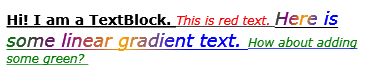
                    new output looks
                                                      Figure 5

TextDecorations

The TextDecorations property represents the text decorations that are applied to the content of aTextBlock. WPF supports only underlined text decoration. 

Listing 7 sets the TextDecorations to underline. 

<TextBlock Name="TextBlock1"        

    Margin="10,10,0,0" VerticalAlignment="Top"   

    HorizontalAlignment="Left"  

    FontSize="12" FontFamily="Verdana"   

    TextWrapping="Wrap" TextAlignment="Left" Padding="2"  

           TextDecorations="Underline">  

                                                      Listing 7

The new output looks as in Figure 6.

              new output looks like
                                                      Figure 6

Summary

In this article, I discussed how to create and format a TextBlock control in WPF and C#. Then we saw how to create a TextBlock control dynamically. Then we saw how to set various properties of a TextBlock such as fonts, Inlines and text decorations.

READ MORE

Tab Control has tab items and each tab item represents a container that is used to host other controls. A typical example of a Tab control is the Visual Studio designer as shown in Figure 1. If you click on theWindow1.xaml tab item, you will see XAML code but if you click on Window1.xaml.cs, you will see C# code behind. 


Figure 1

Create a Tab Control


The TabControl element in XAML represents a Tab Control. 

  1. <TabControl />  

The code snippet in Listing 1 creates a Tab Control and sets it height, width, margin and alignment. The code also adds a TabItem

  1. <TabControl Height="238" HorizontalAlignment="Left" Margin="12,12,0,0"   
  2.             Name="tabControl1" VerticalAlignment="Top" Width="445">  
  3.     <TabItem Header="tabItem1" Name="tabItem1">  
  4.     </TabItem>  
  5. </TabControl>  

Listing 1

The output of Listing 1 looks as in Figure 2.


Figure 2

Adding Tab Items

Tab Control is nothing without a Tab Item. The <TabItem \> element in XAML represents a Tab Item. The Header property of a TabItem represents the header text of the header. The following code creates aTabItem with the header text “Circle”.

          <TabItem Header="Circle">   

             </TabItem>  

A tab item can host other XAML controls similar to a panel or grid control. For example, the following code adds a StackPanel to the tab item and on that StackPanel, it creates a circle with height and width 100. 

 
<TabItem  Header="Circle">  
   <StackPanel>  
<Ellipse Height="100" Width="100" StrokeThickness="5" Stroke="black"  
      Fill="gold"/>  
   </StackPanel>  
</TabItem > 

Using the same preceding approach, I add three tab items to the tab control (Listing 2) called Circle, Rectangle and Polygon. 

<TabControl Height="150" FontFamily="Verdana" FontSize="12" >  
            <TabControl.Background>  
                <SolidColorBrush Color="Green" Opacity="0.30"/>  
            </TabControl.Background>  
            <TabItem  Header="Circle">  
                <StackPanel>  
                    <Ellipse Height="100" Width="100" StrokeThickness="5" Stroke="black"  
      Fill="gold"/>  
                </StackPanel>  
            </TabItem >  
            <TabItem  Header="Rectangle">  
                <StackPanel>  
                    <Rectangle Fill="Yellow" Width="100" Height="100" Stroke="Blue" StrokeThickness="5">  
                    </Rectangle>  
                </StackPanel>  
            </TabItem >  
            <TabItem  Header="Polygon">  
                <StackPanel>  
                    <Polygon Points="100,50 50,100 150,100 100,50 100,30"  
       Stroke="green" StrokeThickness="3" Fill="Yellow"/>  
                </StackPanel>  
            </TabItem >  
</TabControl>  

Listing 2


Part 2: http://tech.queryhome.com/94066/how-to-use-tabcontrol-wpf-and-windows-phone-application-part

READ MORE

Introduction  

The XAML ListBox element represents a ListBox in WPF.

The ListBox tag represents a ListBox control in XAML.

  1. <ListBox></ListBox>  

The Width and Height properties represent the width and the height of a ListBox. The Name property represents the name of the control that is a unique identifier of a control. The Margin property tells the location of a ListBox on the parent control. The HorizontalAlignment and VerticalAlignment properties are used to set horizontal and vertical alignments. 

The following code snippet sets the name, height and width of a ListBox control. The code also sets the horizontal alignment to left and the vertical alignment to top. 

<ListBox Margin="10,10,0,13" Name="listBox1" HorizontalAlignment="Left"  VerticalAlignment="Top" Width="194" Height="200" />  

Adding ListBox Items

ListBox control hosts a collection of ListBoxItems. The following code snippet adds items to a ListBoxcontrol. 

<ListBox Margin="10,10,0,13" Name="listBox1" HorizontalAlignment="Left"   
         VerticalAlignment="Top" Width="194" Height="200">  
    <ListBoxItem Content="Coffie"></ListBoxItem>  
    <ListBoxItem Content="Tea"></ListBoxItem>  
    <ListBoxItem Content="Orange Juice"></ListBoxItem>  
    <ListBoxItem Content="Milk"></ListBoxItem>  
    <ListBoxItem Content="Iced Tea"></ListBoxItem>  
    <ListBoxItem Content="Mango Shake"></ListBoxItem>  
</ListBox>   

The preceding code generates Figure 1. 

ListBox with items
                                          Figure 1. ListBox with items 

Adding ListBox Items Dynamically

In the previous section, we saw how to add items to a ListBox at design-time from XAML. We can add items to a ListBox from the code. 

Let's change our UI and add a TextBox and a button control to the page. The XAML code for the TextBoxand Button controls look like following:

<TextBox Height="23" HorizontalAlignment="Left" Margin="8,14,0,0"   
                 Name="textBox1" VerticalAlignment="Top" Width="127" />  
<Button Height="23" Margin="140,14,0,0" Name="button1" VerticalAlignment="Top"   
                HorizontalAlignment="Left" Width="76" Click="button1_Click">  
            Add Item  
</Button> 

The final UI looks as in Figure 2. 

UI looks
                                                          Figure 2.

On a button click event handler, we add the content of the TextBox to the ListBox by calling theListBox.Items.Add method. The following code adds TextBox contents to the ListBox items. 

private void button1_Click(object sender, RoutedEventArgs e)  
{  
   listBox1.Items.Add(textBox1.Text);  
}  

In the button click event handler, we add the contents of the TextBox to the ListBox by calling theListBox.Items.Add method. 

Now if you enter text into the TextBox and click the Add Item button, it will add the contents of the TextBoxto the ListBox

Adding ListBox items
                              Figure 3. Adding ListBox items dynamically

Deleting ListBox Items 

We can use the ListBox.Items.Remove or ListBox.Items.RemoveAt method to delete an item from the collection of items in the ListBox. The RemoveAt method takes the index of the item in the collection. 

Now, we modify our application and add a new button called Delete Item. The XAML code for this button looks as in the following.

<Button Height="23" Margin="226,14,124,0" Name="DeleteButton"   
  VerticalAlignment="Top" Click="DeleteButton_Click">  
  Delete Item

</Button>   

The button click event handler looks as in following. On this button click, we find the index of the selected item and call the ListBox.Items.RemoveAt method as in the following. 

private void DeleteButton_Click(object sender, RoutedEventArgs e)  
{  
   listBox1.Items.RemoveAt  
  (listBox1.Items.IndexOf(listBox1.SelectedItem));                    
}

READ MORE

A calendar control is used to create a visual calendar that lets users pick a date and fire an event on the selection of the date. This article demonstrates how to create and use a calendar control using XAML and C# in WPF.

Creating a Calendar

The Calendar element represents a calendar control in XAML as in the following:

  1. <Calendar/>  

The Calendar control is defined in the System.Windows.Controls namespace. When you drag and drop a Calendar control from the Toolbox to the page, the XAML code will look like the following code where you can see a Calendar XAML element has been added within the Grid element and its Width, Height, Name and VerticalAlignment and HorizontalAlignment attributes are set.

  1. <Grid>  
  2.    <Calendar Height="170" HorizontalAlignment="Left" Margin="58,32,0,0"   
  3.       Name="calendar1" VerticalAlignment="Top" Width="180" />  
  4. </Grid>  

The default view of the Calendar control looks as in Figure 1. 


Figure 1

The Width and Height attributes of the Calendar element represent the width and the height of a Calendar. The Content attribute represents the text of a Calendar. The Name attribute represents the name of the control, that is a unique identifier of a control. 

The code snippet in Listing 1 creates a Calendar control and sets the name, height and width properties of a Calendar control. 

  1. <Calendar Name=" MonthlyCalendar" Height="30" Width="100" >  
  2. </Calendar>  

Listing 1

Display Modes

The DisplayMode property of the Calendar class represents the format of the display of a Calendar, that can be a month, year, or decade. Month is the default mode. Setting the DisplayMode to Year and Decade generates Figure 2 and Figure 3 respectively. 


Figure 2


Figure 3


The Month view that is also the default view looks as in Figure 4.


Figure 4

If you use an example of the Decade and click on the year 2008 in Figure 3, you will get another Calendar format with all the months in the year 2008 and if you click on any month, you will eventually get the month view of the Calendar. 

The following code snippet sets the DisplayMode property to Decade. 

  1. <Calendar DisplayMode="Decade">   
  2. </Calendar>  

Selection Modes and Selection Dates

The SelectedDate property represents the currently selected date. If multiple dates selection is true, the SelectedDates property represents a collection of currently selected dates. 

The SelectionMode of type CalendarSelectionMode enumeration represents the selection mode of calendar. Table 1 describes the CalendarSelectionMode enumeration and its members. 
 

CalendarSelectionModeDescription
NoneNo selections are allowed.
SingleDateOnly a single date can be selected, either by setting SelectedDate or the first value in SelectedDates. AddRange cannot be used.
SingleRangeA single range of dates can be selected. Setting SelectedDate, adding a date individually to SelectedDates, or using AddRange will clear all previous values from SelectedDates.
MultipleRangeMultiple non-contiguous ranges of dates can be selected. Adding a date individually to SelectedDates or using AddRange will not clear SelectedDates. Setting SelectedDate will still clear SelectedDates, but additional dates or range can then be added. Adding a range that includes some dates that are already selected or overlaps with another range results in the union of the ranges and does not cause an exception.

The following code snippet sets the SelectionMode property to a single range.

  1. <Calendar SelectionMode="SingleRange">  
  2. </Calendar>  

BlackoutDates

The BlackoutDates property of the Calendar class represents a collection of dates that are not available for selection. All non-selection dates are marked by a cross. For example, say in the month of March of the year 2010, we would like to block the dates from Jan 1st to Jan 7th and then all Sundays and the final calendar should look as in Figure 5.


Figure 5

Part 2 Continuous..

READ MORE

Introduction 

The RichTextBox control allows you to view and edit text, paragraph, images, tables and other rich text format contents. 

The RichTextBox tag represents a RichTextBox control in XAML. 

<RichTextBox></RichTextBox>  

The Width and Height properties represent the width and the height of a RichTextBox. The Name property represents the name of the control, that is a unique identifier of a control. The Margin property tells the location of a RichTextBox on the parent control. The HorizontalAlignment andVerticalAlignment properties are used to set horizontal and vertical alignments. 

The following code snippet sets the name, height and width of a RichTextBox control. The code also sets the horizontal alignment to left and the vertical alignment to top. 

<RichTextBox Margin="10,10,0,13" Name="RichTextBox1" HorizontalAlignment="Left"   

                 VerticalAlignment="Top" Width="500" Height="300" />  

Displaying and Edit Text 

RichTextBox control hosts a collection of RichTextBoxItem. The following code snippet adds items to a RichTextBox control.


<RichTextBox Margin="10,10,0,13" Name="RichTextBox1" HorizontalAlignment="Left"   
             VerticalAlignment="Top" Width="500" Height="300">  
    <FlowDocument>  
        <Paragraph>  
            I am a flow document. Would you like to edit me?  
            <Bold>Go ahead.</Bold>                  
        </Paragraph>  
        
        <Paragraph Foreground="Blue">            
            I am blue I am blue I am blue.    
        </Paragraph>  
    </FlowDocument>          
</RichTextBox> 

The preceding code generates Figure 1 where you can begin editing text right away.

RichTextBox with editable text

Creating and Using RichTectBox Dynamically 

In the previous section, we saw how to create and use a RichTextBox in XAML. WPF provides the RichTextBox class that represents a RichTextBox control. In this section, we will see how to use this class to create and use a RichTextBox control dynamically. 

The code listed in Listing 1 creates a FlowDocument, adds a paragraph to the flow document and sets the Document property of the RichTextBox to FlowDocument.


private void CreateAndLoadRichTextBox()  
{  
    // Create a FlowDocument  
    FlowDocument mcFlowDoc = new FlowDocument();  
  
    // Create a paragraph with text  
    Paragraph para = new Paragraph();  
    para.Inlines.Add(new Run("I am a flow document. Would you like to edit me? "));  
    para.Inlines.Add(new Bold(new Run("Go ahead.")));  
  
    // Add the paragraph to blocks of paragraph  
    mcFlowDoc.Blocks.Add(para);  
  
    // Create RichTextBox, set its hegith and width  
    RichTextBox mcRTB = new RichTextBox();  
    mcRTB.Width = 560;  
    mcRTB.Height = 280;  
  
    // Set contents  
    mcRTB.Document = mcFlowDoc;  
  
    // Add RichTextbox to the container  
    ContainerPanel.Children.Add(mcRTB);       
}  

Listing 1

The output of Listing 1 generates Figure 2.

Listing 1 doc

Enable Spelling Check 

RichTextBox control comes with spell check functionality out-of-the-box. By setting theSpellCheck.IsEnabled property to true enables spell checking in a RichTextBox

SpellCheck.IsEnabled="True"  

You can set this in code as follows:

mcRTB.SpellCheck.IsEnabled = true;  

Now if you type some text, the wrong word would be underlined with the Red color. See in Figure 3.

RichTextBox with Spell Check Enabled


Loading a Document in RichTextBox
We can use the RichTextBox.Items.Remove or RichTextBox.Items.RemoveAt methods to delete an item from the collection of items in the RichTextBox. The RemoveAt method takes the index of the item in the collection. 
Now, we modify our application and add a new button called Delete Item. The XAML code for this button looks as in the following:  

private void LoadTextDocument(string fileName)  
{  
    TextRange range;  
    System.IO.FileStream fStream;  
    if (System.IO.File.Exists(fileName))  
    {  
        range = new TextRange(RichTextBox1.Document.ContentStart, RichTextBox1.Document.ContentEnd);  
        fStream = new System.IO.FileStream(fileName, System.IO.FileMode.OpenOrCreate);  
        range.Load(fStream, System.Windows.DataFormats.Text );  
        fStream.Close();  
    }  
}

READ MORE

The XAML Tooltip element represents a window tooltip. A ToolTip is a pop-up window that displays some information in a small window. This article shows how to use a ToolTip control in WPF.

Creating a ToolTip

The ToolTip element represents a ToolTip control in XAML

<ToolTip/>  

The IsOpen property indicates whether or not a ToolTip is visible. The HorizontalOffset and VerticalOffsetproperties represent the horizontal and vertical distance between the target control and the pop-up window. The Content property represents the contents of the ToolTip. 

The code snippet in Listing 1 creates a ToolTip control and sets the horizontal offset, vertical offset and content of a ToolTip control. 


<ToolTip Content="Hello! I am a ToolTip."   
HorizontalOffset="10" VerticalOffset="20"/> 

                                                            Listing 1

The output looks as in Figure 1. 

                                              Creating a ToolTip
                                       

ToolTip Service

To display a tooltip for a control, the ToolTipService class must be used. The SetToolTip and GetToolTipstatic methods are used to set and get the tooltip of a control. 

The following code snippet creates a ToolTipService.ToolTip for a control.


<ToolTipService.ToolTip >   
    <ToolTip Content="Hello! I am a ToolTip."   
    HorizontalOffset="10" VerticalOffset="20"/>  
</ToolTipService.ToolTip>   


 <Button Content="Mouse over me" Width="150" Height="30"  
        Canvas.Top="10" Canvas.Left="10">  
    <ToolTipService.ToolTip >   
        <ToolTip Content="Hello! I am a ToolTip."   
        HorizontalOffset="10" VerticalOffset="20"/>  
    </ToolTipService.ToolTip>  
</Button>                                            


Then if you run the application and hover the mouse over the button control, the output looks as in Figure 2.

                                    ToolTip Service
                                                       

Creating a Fancy Tooltip

The ToolTip content can be any control and multiple controls. The code snippet in Listing 4 creates aToolTip with an image and text in it. 

          <!-- Create a button -->  
<Button Content="Mouse over me" Width="150" Height="30"   
        Canvas.Top="50" Canvas.Left="20">  
    <!-- Create a tooltip by using the ToolTipService -->  
    <ToolTipService.ToolTip >  
        <ToolTip HorizontalOffset="0" VerticalOffset="0">  
            <!-- Add a StackPanel to the tooltip content -->  
            <StackPanel Width="250" Height="150">  
                <!-- Add an image -->  
                <StackPanel.Background>  
                    <ImageBrush ImageSource="Garden.jpg"  
                                Opacity="0.4"/>  
                </StackPanel.Background>  
                <!-- Add a text block -->  
                <TextBlock >  
                    <Run Text="This is a tooltip with an image and text"  
                        FontFamily="Georgia" FontSize="14" Foreground="Blue"/>  
                </TextBlock>  
            </StackPanel>  
        </ToolTip>  
    </ToolTipService.ToolTip>  
</Button>                                       


The new tooltip looks as :

                  Creating a Fancy Tooltip


READ MORE

The XAML Toolbar element represents a window toolbar. A ToolBar control is a group of controls that are typically related in functionality. A typical ToolBar is a toolbar in Microsoft Word and Visual Studio where you see File Open, Save and Print buttons. 

This article discusses basic components of ToolBar controls in WPF and how to use them in your applications. 

Creating a Toolbar

The ToolBar element in XAML represents a WPF ToolBar control. 

<ToolBar />  
The code snippet in Listing 1 creates a ToolBar control and sets its width and height properties. You may place any control on a ToolBar but typically buttons are used. A ToolBar sits on a ToolBarTray. The code snippet in Listing 1 adds three buttons to the ToolBar and places a ToolBar on a ToolBarTray.
<ToolBarTray Background="DarkGray" Height="30" VerticalAlignment="Top">  
  
<ToolBar Name="MyToolbar" Width="200" Height="30" >  
    <Button Background="LightSkyBlue" Content="Open" />  
    <Button Background="LightSkyBlue" Content="Close" />  
    <Button Background="LightSkyBlue" Content="Exit" />  
</ToolBar>  
  
</ToolBarTray>  
                                                      Listing 1


The output looks as in Figure 1. 

         window
                                                      Figure 1

Adding ToolBar Button Click Event Handlers

The best part of WPF is that these buttons are WPF Button controls so you have a choice to use them on any other button. You may format them the way you like. You may add a click event handler to them and so on. 

The code snippet in Listing 2 adds click event handlers to all three ToolBar buttons. 
<ToolBar Name="MyToolbar" Width="200" Height="30"  >  
    <Button Background="LightSkyBlue" Content="Open" Name="OpenButton" Click="OpenButton_Click"  />  
    <Button Background="LightSkyBlue" Content="Close" Name="CloseButton" Click="CloseButton_Click"  />  
    <Button Background="LightSkyBlue" Content="Exit" Name="ExitButton" Click="ExitButton_Click"   />  
 </ToolBar>  
                                                      Listing 2

On these button click event handlers, you would want to write the code you want to execute when these buttons are clicked. For example, I show a message when these buttons are clicked. The code for these button click event handlers is as in Listing 3.
private void OpenButton_Click(object sender, RoutedEventArgs e)  
{  
    MessageBox.Show("Open button is clicked.");  
}  
  
private void CloseButton_Click(object sender, RoutedEventArgs e)  
{  
    MessageBox.Show("Close button is clicked.");  
}  
  
private void ExitButton_Click(object sender, RoutedEventArgs e)  
{  
    MessageBox.Show("Exit button is clicked.");  
}  
                                                      Listing 3

If you click on the Open button, you will see Figure 2 as output. 

                                    button
                                                      Figure 2

Adding Images to ToolBar Buttons 

Usually ToolBars look nicer than just displaying text. In most cases, they have icons. Displaying an Icon image on a button is simply placing an Image control as the content of a Button. The code snippet in Listing 4 changes the Button contents from text to images. 
<ToolBarTray Background="DarkGray" Height="30" VerticalAlignment="Top">  
    <ToolBar Name="MyToolbar" Width="200" Height="30" Background="LightCoral" >  
        <Button Name="OpenButton" Click="OpenButton_Click">  
            <Image Source="Images\camera.png" />  
         </Button>  
        <Button Name="CloseButton" Click="CloseButton_Click">  
            <Image Source="Images\ctv.png" />  
        </Button>  
        <Button Name="ExitButton" Click="ExitButton_Click" >  
            <Image Source="Images\find.png" />  
        </Button>  
    </ToolBar>  
</ToolBarTray>  
                                                      Listing 4

The new ToolBar looks as in Figure 3.

                    ToolBar
                                                      Figure 3

Adding Separators to a ToolBar

You may use a Separator control to give your ToolBar buttons a more prominent look. The code snippet in Listing 4 adds a few extra buttons and a few separators to a ToolBar.
<ToolBarTray Background="DarkGray" Height="30" VerticalAlignment="Top">  
    <ToolBar Name="MyToolbar" Width="180" Height="30" Background="LightCoral" >  
        <Separator />  
        <Button Name="OpenButton" Click="OpenButton_Click">  
            <Image Source="Images\camera.png" />  
         </Button>  
        <Button Name="CloseButton" Click="CloseButton_Click">  
            <Image Source="Images\ctv.png" />  
        </Button>  
        <Button Name="ExitButton" Click="ExitButton_Click" >  
            <Image Source="Images\find.png" />  
        </Button>  
        <Separator Background="Yellow" />  
        <Button >  
            <Image Source="Images\award.png" />  
        </Button>  
        <Button >  
            <Image Source="Images\cuser.png" />  
        </Button>  
        <Button >  
            <Image Source="Images\next.png" />  
        </Button>  
        <Button >  
            <Image Source="Images\code.png" />  
        </Button>  
        <Separator />  
    </ToolBar>  
</ToolBarTray>  
                                                      Listing 5

The ToolBar with separators looks as in Figure 4. Also, if you notice there is a drop array that is available when buttons do not fit in a ToolBar. If you click on that, you will see the rest of the buttons.

   
         fit in a ToolBar
                                                      Figure 4

Summary

In this article, I discussed how to use a ToolBar control in WPF and C#.

READ MORE
...