top button
Flag Notify
    Connect to us
      Site Registration

Site Registration

How to use SplitView Control A New XAML Control?

+4 votes
643 views

Introduction


Figure 1: 
SpiltView Navigation Framework

The very idea of SpiltView originates from the Navigation Framework inside a XAML application. The navigation framework was introduced with Silverlight. The major components of the Navigation Framework were:

  1. Frame
  2. Page

The Frame here is much like the browser that was used to contain a page that can be navigated back and forth. Here, the frontward stack and the backward stack.

They supported a series of methods, namely:

  1. GoBack()
  2. GoForward()
  3. CanGoBack()
  4. CanGoForward()

But often it's only about the navigation that the developers are concerned about. This is why you have SplitView. SplitView helps us to navigate by “type” and not the URI that we used to do in Silverlight. Also, we don't need to care about the physical location of the file as well. 

The Page 

The page has the following two methods:

  1. OnNavigatedTo(Param)
  2. OnNavigatedFrom()

These two overridden methods help to navigate and hence help us to interact with the page.

Although there are a few more things worth noticing in Page.NavigationCacheMode that are primarily concerned with whether the page is supposed to be created again or the same instance of the page will be rendered.

Jumping with SpitView

SplitView is there for navigation. That means this gives a smoother way to navigate with menus and making the UI smoother and more fluid. 

Where to use a SpiltView


Figure 2: 
SpiltView Usage

Universally this is also know as the “Hamburger Menu” because it has two pieces of bread forming a nice Big Boy burger. But yes, that’s the split view. It’s a menu that takes care of a tons of problems a developer has while transiting from one page to another or simply just navigating from one part of the app to another. 

Behaviors of a SplitView


Figure 3: 
Behaviors of a SplitView

A SplitView when it is tapped pops out a menu and shows various options. Although it's not a requirement to have the Split View respond to a tap request.

Where to get the SplitView from


Figure 4: 
Font Selection

The new Segoe Font will have the SplitView. All these are vectors and are oriented to the Windows 10 Style.

Application of the SplitView

A SplitView namely has the following 2 things:

  • SplitView.Pane
  • SplitView.Content

Details

Let's talk in details about SplitView.Pane.


Figure 5: SplitView Pane

A Pane is where the developer puts in all the buttons that are either on the left or the right of the application. The Pane will also takes the kinds of buttons that will be available for tapping in the application.

The SplitView.Content


Figure 6: 
SplitView Content

The most important property is the Content property. The Content Property sits over the frame and gives a navigation affordance. The Content also gives us a lot of grip with the overlay on the UI. 

The SplitView.PaneDisplayMode

Depending on whether the SplitView is open or closed we have the PaneDisplayMode as its property.


Figure 7: PaneDisplayMode Properties

The Inline, when set to true, will provide a jolting experience to the user since the content will shift the SplitView opened up. In case of the overlay although the content will not shift, it will simply have the splitview menu coming out as a flyer over the content. The CompactInline will have the capabilities of shifting the content to a large extent if the SplitView is set to true or just have a sleek thin outline when set to false. The Compact overlay will have the same properties like the overlay only difference is in both of the cases of a Compact Overlay there will be a slight shift of content.

posted Oct 6, 2015 by Jdk

  Promote This Article
Facebook Share Button Twitter Share Button LinkedIn Share Button


Related Articles


The great thing about XAML is that you can easily change the foreground colour of controls, such as a TextBlock, to be exactly what you want it to be. Whether that is through the built-in colour names or a HEX colour is completely your choice.


However there may be times when you simply wish to change the colour of a control dependent on the value that it is displaying. In this example we will be using a TextBlock that has it's Text value assigned to it using data context binding.


MainPage.xaml

<Page        
    x:Class="MainPage"    
    xmlns="http://schemas.microsoft.com/winfx/2006/xaml/presentation"    
    xmlns:x="http://schemas.microsoft.com/winfx/2006/xaml"    
    xmlns:local="using:TestProject"    
    xmlns:d="http://schemas.microsoft.com/expression/blend/2008"    
    xmlns:mc="http://schemas.openxmlformats.org/markup-compatibility/2006"        
    mc:Ignorable="d">    
    <Page.Resources>    
        <DataTemplate x:Key="listViewItems">    
            <StackPanel>    
                <TextBlock        
                    Margin="5,5,5,5"        
                    Text="{Binding Name}"        
                    Style="{StaticResource BaseTextBlockStyle}"/>    
                <TextBlock        
                    Margin="5,5,5,5"        
                    Text="{Binding Ripeness}"        
                    Style="{StaticResource BaseTextBlockStyle}"/>    
            </StackPanel>    
        </DataTemplate>    
    </Page.Resources>    
    <Grid Background="{ThemeResource ApplicationPageBackgroundThemeBrush}">    
        <ListView        
            x:Name="listViewTest"        
            Margin="5,5,5,5"        
            VerticalAlignment="Center"        
            HorizontalAlignment="Center"        
            ItemsSource="{Binding}"        
            SelectionMode="None"        
            IsItemClickEnabled="False"        
            ItemTemplate="{StaticResource listViewItems}"        
            ContainerContentChanging="listViewUpdated"></ListView>    
        <TextBlock        
            x:Name="listViewNoItems"        
            Margin="5,5,5,5"        
            VerticalAlignment="Center"        
            HorizontalAlignment="Center"        
            Text="There are no fruits in your list to display!"        
            Style="{StaticResource BaseTextBlockStyle}"        
            Visibility="Collapsed"/>    
        <Button        
            Width="150"        
            Height="50"        
            Margin="20"        
            VerticalAlignment="Center"        
            HorizontalAlignment="Right"        
            Content="Clear fruit"        
            Click="clearFruitBasket"/>    
    </Grid>    
</Page>  


MainPage.xaml.cs


using System.Collections.ObjectModel;    
using Windows.UI.Xaml;    
using Windows.UI.Xaml.Controls;    
namespace CSharpCornerTestProject     
{    
    public class Fruit     
    {    
        public string Name    
        {    
            get;    
            set;    
        }    
        public string Ripeness     
        {    
            get;    
            set;    
        }    
    }    
    public sealed partial class MainPage: Page     
    {    
        private ObservableCollection < Fruit > fruitList = new ObservableCollection < Fruit > ();    
        public MainPage()     
        {    
            this.InitializeComponent();    
            fruitList.Add(new Fruit()    
            {    
                Name = "Apple", Ripeness = "Ok"    
            });    
            fruitList.Add(new Fruit()    
            {    
                Name = "Banana", Ripeness = "Bad"    
            });    
            fruitList.Add(new Fruit()    
            {    
                Name = "Kiwi", Ripeness = "Rotten"    
            });    
    
            listViewTest.ItemsSource = fruitList;    
        }    
        private void listViewUpdated(ListViewBase sender, ContainerContentChangingEventArgs args) {    
            if (listViewTest.Items.Count == 0)     
            {    
                listViewNoItems.Visibility = Visibility.Visible;    
                listViewTest.Visibility = Visibility.Collapsed;    
            }     
            else     
            {    
                listViewNoItems.Visibility = Visibility.Collapsed;    
                listViewTest.Visibility = Visibility.Visible;    
            }    
           }    
        private void clearFruitBasket(object sender, RoutedEventArgs e)    
        {    
            // clear the fruit list!        
            if (fruitList != null) fruitList.Clear();    
        }    
    }    
}

As I stated above, this is the code base that we used in my previous article about displaying a message once a ListView control no longer has any items in it. We will slightly modify this now so that the ripeness of the fruit in our fruit basket is colour-coded depending on its value.


The first thing we need to do is to create a convertor class for us to use when binding data to the list view. This is a very simple affair and just requires you to add a new "Class file" to your project.


FruitBasketConvertor.cs

using System;    
using Windows.UI;    
using Windows.UI.Xaml.Data;    
using Windows.UI.Xaml.Media;    
namespace CSharpCornerTestProject.Convertors     
{    
    public class fruitBasketRipenessForegroundConvertor: IValueConverter    
    {    
        public object Convert(object value, Type targetType, object parameter, string language)    
        {    
            string ripeness = (value as string);    
            if (ripeness == "Ok") return new SolidColorBrush(Colors.ForestGreen);    
            else if (ripeness == "Bad") return new SolidColorBrush(Colors.OrangeRed);    
            else if (ripeness == "Rotten") return new SolidColorBrush(Colors.DarkRed);    
            // default return value of lime green      
            return new SolidColorBrush(Colors.LimeGreen);    
        }    
        public object ConvertBack(object value, Type targetType, object parameter, string language)    
        {    
            throw new NotImplementedException();    
        }    
    }    
}  

That is all there is to our file, just those 30 lines. Do take note, however, that we have placed the convertors under their own namespace, CSharpCornerTestProject.Convertors.


Using convertors isn't all as daunting as it seems. You create your own custom class, making sure that it derives from IValueConvertor.  Then all we need are two functions.

public object Convert(object value, Type targetType, object parameter, string language)  
{  
    // your convertor code goes here    
}  
public object ConvertBack(object value, Type targetType, object parameter, string language)   
{  
    // your convert back code goes here    
}

The Convert function takes the raw value of your binding and allows you to access anything associated with that, whether it is a class, a string, or anything of your choosing.


The ConvertBack function is generally not used all that often and so in our example we are leaving it asthrow new NotImplementedException();. Its main use would be if you wanted to convert the value back to its original state.


Returning to the Convert function, this is very simple and there isn't all that much to it at all. All we do here is take the object value and store it into our string variable, ripeness.  

public object Convert(object value, Type targetType, object parameter, string language)   
{  
    string ripeness = (value as string);  
    if (ripeness == "Ok") return new SolidColorBrush(Colors.ForestGreen);  
    else if (ripeness == "Bad") return new SolidColorBrush(Colors.OrangeRed);  
    else if (ripeness == "Rotten") return new SolidColorBrush(Colors.DarkRed);  
    // default return value of lime green      
    return new SolidColorBrush(Colors.LimeGreen);  
}   

Since we have different forms of Ripeness in our Fruit class, we have three separate if statements to determine which colour we should return for our Foreground colour.


When converting a Foreground (or Background) XAML member, it expects a SolidColorBrush to be returned and so that is what we are giving it.


That is everything that we need to do for the code side of things with our convertor, the next step is much simpler and only requires us to add three new lines of code to the existing MainPage.xaml file that we have.


In our Page control, we need to add a new member, highlighted in bold Green.

<Page  
x:Class="MainPage"  
    xmlns="http://schemas.microsoft.com/winfx/2006/xaml/presentation"  
    xmlns:x="http://schemas.microsoft.com/winfx/2006/xaml"  
    xmlns:local="using:rTestProject"  
    xmlns:d="http://schemas.microsoft.com/expression/blend/2008"  
    xmlns:mc="http://schemas.openxmlformats.org/markup-compatibility/2006"  
    xmlns:utils="using:TestProject.Convertors"  
mc:Ignorable="d">  

This will allow us to access the custom convertor class that we just created in FruitBasketConvertor.cs.


Now that we have done that, we need to add our convertor function as a page resource and provide it a key. This will allow us to access it when using the binding convertor. Once again, the addition is highlighted in bold Green.

<Page.Resources>  
    <utils:fruitBasketRipenessForegroundConvertor x:Key="ripenessConvertor"/>  
    <DataTemplate x:Key="listViewItems">  
        <StackPanel>  
            <TextBlock      
                Margin="5,5,5,5"      
                Text="{Binding Name}"      
                Style="{StaticResource BaseTextBlockStyle}"/>  
            <TextBlock      
                Margin="5,5,5,5"      
                Text="{Binding Ripeness}"      
                Style="{StaticResource BaseTextBlockStyle}"/>  
        </StackPanel>  
    </DataTemplate>  
</Page.Resources>

Now that we have given our convertor a key, we can access it anywhere in the MainPage.xaml file when we are binding items. We just have one last thing to do now, that is to add a Foreground member to the TextBlock control that is telling us how ripe our fruit is.

<TextBlock    
    Foreground="{Binding Ripeness, Converter={StaticResource ripenessConvertor}}"    
    Margin="5,5,5,5"    
    Text="{Binding Ripeness}"    
    Style="{StaticResource BaseTextBlockStyle}"/>    

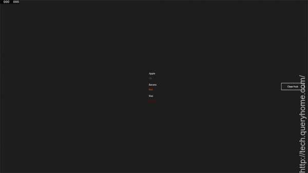
That is everything that we need to do to start dynamically changing the foreground colour of our XAML controls dependent on what the value they're displaying is. If you run the app your fruit basket should now show the Ripeness of each fruit in the three different colours that we assigned earlier on whilst creating our convertor function.


READ MORE

In this article, I will try to make a representation of the Grid object witch is directly derived from the Panel abstract class and we can say that is a flexible area that contains rows and columns, it plays a role of container in a given WPF window. The grid could be found in the PresentationFramework assembly. The grid control could be used to create a complex layout that gives to the application an attractive and ergonomic look. So let's discover how to configure it using XAML in this part and in second part I will illustrate how to perform the same task using the code behind, I mean C#.

At first look, when a new WPF application is defined, we have the impression that there is not controls but the window one, even if the "<Grid></Grid>" tags are presents, and the first question that one can ask is where are the grid lines if it is a grid really? 


Figure 1

I tell you ok try this code:

<Grid ShowGridLines="True">

        <Grid.RowDefinitions>

            <RowDefinition></RowDefinition>

            <RowDefinition></RowDefinition>

            <RowDefinition></RowDefinition>

        </Grid.RowDefinitions>

        <Grid.ColumnDefinitions>

            <ColumnDefinition></ColumnDefinition>

            <ColumnDefinition></ColumnDefinition>

            <ColumnDefinition></ColumnDefinition>

        </Grid.ColumnDefinitions>       

    </Grid>

I use the <Grid.RowDefinitions> to define a collection of rows and a<Grid.ColumnDefinitions> to define columns collection. In the other hand I use<RowDefinition> to define a row element within the grid control and <ColumnDefinition> to define a column element, and then I set ShowGridLines property to true, it is very important in order to render columns and rows visible. The result will be as follows:

Figure 2

The columns and rows definition mode could be, namely star, Auto or Pixel.

The Star definition

It means that the related size could be expressed as weighted proportion of available space, for example if a size of a given first row is double of a second given row size, then the first one will receive two units of the entire grid size, meanwhile, the second one will have one unit as size. Rows and columns sizes are expressed by this symbol * that represents a unit of size. The XAML code sample illustrates how to define a size based on star definition.

<Grid ShowGridLines="True" >

        <Grid.RowDefinitions>

            <RowDefinition></RowDefinition>

            <RowDefinition></RowDefinition>

            <RowDefinition></RowDefinition>

        </Grid.RowDefinitions>

        <Grid.ColumnDefinitions>

            <ColumnDefinition Width="2*"></ColumnDefinition>

            <ColumnDefinition></ColumnDefinition>

            <ColumnDefinition></ColumnDefinition>

        </Grid.ColumnDefinitions>       

    </Grid>

The result of the above code is:

Figure 3

The above code sets the first column width as double of the reset of the columns.

The Pixel definition

It means that the size is defined in terms of pixels such as in the ASP applications. This bellow code illustrate how to define a dimension of a given column or row based on pixels

<Grid ShowGridLines="True" >

        <Grid.RowDefinitions>

            <RowDefinition></RowDefinition>

            <RowDefinition></RowDefinition>

            <RowDefinition></RowDefinition>

        </Grid.RowDefinitions>

        <Grid.ColumnDefinitions>

            <ColumnDefinition Width="100px"></ColumnDefinition>

            <ColumnDefinition></ColumnDefinition>

            <ColumnDefinition></ColumnDefinition>

        </Grid.ColumnDefinitions>       

    </Grid>

And this is a presentation of what could be if such alternative is used

Figure 4

The Auto definition

It means that the size is proportional to the content object size. Once the column or the row width or height is set to auto and there is no object contained with it. It disappears from the grid but it doesn't mean that it is deleted. If you add controls within, it takes exactly the control dimension. For example, if we make a rectification of the previous code

<Grid ShowGridLines="True" >

        <Grid.RowDefinitions>

            <RowDefinition></RowDefinition>

            <RowDefinition></RowDefinition>

            <RowDefinition></RowDefinition>

        </Grid.RowDefinitions>

        <Grid.ColumnDefinitions>

            <ColumnDefinition Width="Auto"></ColumnDefinition>

            <ColumnDefinition></ColumnDefinition>

            <ColumnDefinition></ColumnDefinition>

        </Grid.ColumnDefinitions>       

    </Grid>

The grid appearance will be

Figure 5

Cut  Width="Auto"  then drag and drop a button into the grid and make sure that it is contained within the row 0 , column 0 grid cellule and this is the XAML button code.

<Button Grid.Column="0" Grid.Row="0" Width="100" Name="button1">Button</Button>

Now, paste Width="Auto" exactly in its previous place and you will observe this. As you see the button is clipped rather that scrolled.

Figure 6


READ MORE

In this article you will learn how to create and use a CustomResource in XAML.


  1. Open a new Visual C# windows project.
     
  2. Add a new class named say CustomResourceTest.cs in the project folder.

    CustomResourceTest.cs
     
  3. Derive this class from CustomXamlResourceLoader Class(Case sensitive) like below:

    CustomXamlResourceLoader Class
     
  4. You will get a Namespace not found error. Resolve it by using Windows.UI.Xaml.Resources Namespace.

    Windows.UI.Xaml.Resources
     
  5. Override the GetResource Member of the parent class as below. Use the intellisense to select the member.

    getresource

    getresource1
     
  6. Replace the Code inside the GetResource Method as: (this is just a simple example). We are returning a text. We plan to show this text inside a TextBlock’s Text Property.

    TextBlock
     
  7. Inside the MainPage.cs . Add the following line of code inside the MainPage Constructor to reference the CustomResouceTest.cs Class from the Page’s XAML.

    MainPage

    Correct the NameSpace not found error by resolving it.
     
  8. Now go to the MainPage.xaml Page and Add a TextBlock as follows. Notice the Text property of the TextBlock.

    MainPage.xaml
     
  9. This results in the following output when you save, build and run the project.

    run
     
  10. What is happening here?
     
    • We created a CustomResourceClass where we inherited the Class called CustomXamlResourceLoader.
    • We override the GetResourceProperty. Don’t focus on the parameters of this method for now.
    • We replaced the code inside this method by simply returning a text.
    • To access this CustomResource from XAML we have to define the CustomXamlResourceLoader. Current property to the new instance of the Class we created. We have to do this inside the Constructor of the Codebehind page where we want to use the CustomResource.
    • We then simply assigned the value of the Text property of the textblock to the CustomResource as seen on Step 8.

Example 2:

  1. Now we will try a different example where we want to display the Text of the TextBlock based on the value we pass on. Change the text of the Mainpage.xaml as:

    Mainpage.xaml 2
     
  2. The 'sayHello' string is passed as a string to the CusomResourceTest.cs class as ResourceID parameter of the overridden class. This will be more clear as you see in the next step.
     
  3. In the CustomResourceTest.cs class , change the code as follows:

    CustomResourceTest.cs2
     
  4. The thing to understand is how we pass the ResourceID from the Text Property of the TextBlock. It is passed as the resourceID parameter. So, based on the ResourceID, we return the appropriate text we want to display on the output screen.
     
  5. So now we get output as.
  6. If we change the text property as sayByeBye.

    sayByeBye
     
  7. We get the following output:
     
READ MORE

Introduction 

The RichTextBox control allows you to view and edit text, paragraph, images, tables and other rich text format contents. 

The RichTextBox tag represents a RichTextBox control in XAML. 

<RichTextBox></RichTextBox>  

The Width and Height properties represent the width and the height of a RichTextBox. The Name property represents the name of the control, that is a unique identifier of a control. The Margin property tells the location of a RichTextBox on the parent control. The HorizontalAlignment andVerticalAlignment properties are used to set horizontal and vertical alignments. 

The following code snippet sets the name, height and width of a RichTextBox control. The code also sets the horizontal alignment to left and the vertical alignment to top. 

<RichTextBox Margin="10,10,0,13" Name="RichTextBox1" HorizontalAlignment="Left"   

                 VerticalAlignment="Top" Width="500" Height="300" />  

Displaying and Edit Text 

RichTextBox control hosts a collection of RichTextBoxItem. The following code snippet adds items to a RichTextBox control.


<RichTextBox Margin="10,10,0,13" Name="RichTextBox1" HorizontalAlignment="Left"   
             VerticalAlignment="Top" Width="500" Height="300">  
    <FlowDocument>  
        <Paragraph>  
            I am a flow document. Would you like to edit me?  
            <Bold>Go ahead.</Bold>                  
        </Paragraph>  
        
        <Paragraph Foreground="Blue">            
            I am blue I am blue I am blue.    
        </Paragraph>  
    </FlowDocument>          
</RichTextBox> 

The preceding code generates Figure 1 where you can begin editing text right away.

RichTextBox with editable text

Creating and Using RichTectBox Dynamically 

In the previous section, we saw how to create and use a RichTextBox in XAML. WPF provides the RichTextBox class that represents a RichTextBox control. In this section, we will see how to use this class to create and use a RichTextBox control dynamically. 

The code listed in Listing 1 creates a FlowDocument, adds a paragraph to the flow document and sets the Document property of the RichTextBox to FlowDocument.


private void CreateAndLoadRichTextBox()  
{  
    // Create a FlowDocument  
    FlowDocument mcFlowDoc = new FlowDocument();  
  
    // Create a paragraph with text  
    Paragraph para = new Paragraph();  
    para.Inlines.Add(new Run("I am a flow document. Would you like to edit me? "));  
    para.Inlines.Add(new Bold(new Run("Go ahead.")));  
  
    // Add the paragraph to blocks of paragraph  
    mcFlowDoc.Blocks.Add(para);  
  
    // Create RichTextBox, set its hegith and width  
    RichTextBox mcRTB = new RichTextBox();  
    mcRTB.Width = 560;  
    mcRTB.Height = 280;  
  
    // Set contents  
    mcRTB.Document = mcFlowDoc;  
  
    // Add RichTextbox to the container  
    ContainerPanel.Children.Add(mcRTB);       
}  

Listing 1

The output of Listing 1 generates Figure 2.

Listing 1 doc

Enable Spelling Check 

RichTextBox control comes with spell check functionality out-of-the-box. By setting theSpellCheck.IsEnabled property to true enables spell checking in a RichTextBox

SpellCheck.IsEnabled="True"  

You can set this in code as follows:

mcRTB.SpellCheck.IsEnabled = true;  

Now if you type some text, the wrong word would be underlined with the Red color. See in Figure 3.

RichTextBox with Spell Check Enabled


Loading a Document in RichTextBox
We can use the RichTextBox.Items.Remove or RichTextBox.Items.RemoveAt methods to delete an item from the collection of items in the RichTextBox. The RemoveAt method takes the index of the item in the collection. 
Now, we modify our application and add a new button called Delete Item. The XAML code for this button looks as in the following:  

private void LoadTextDocument(string fileName)  
{  
    TextRange range;  
    System.IO.FileStream fStream;  
    if (System.IO.File.Exists(fileName))  
    {  
        range = new TextRange(RichTextBox1.Document.ContentStart, RichTextBox1.Document.ContentEnd);  
        fStream = new System.IO.FileStream(fileName, System.IO.FileMode.OpenOrCreate);  
        range.Load(fStream, System.Windows.DataFormats.Text );  
        fStream.Close();  
    }  
}

READ MORE

The XAML Tooltip element represents a window tooltip. A ToolTip is a pop-up window that displays some information in a small window. This article shows how to use a ToolTip control in WPF.

Creating a ToolTip

The ToolTip element represents a ToolTip control in XAML

<ToolTip/>  

The IsOpen property indicates whether or not a ToolTip is visible. The HorizontalOffset and VerticalOffsetproperties represent the horizontal and vertical distance between the target control and the pop-up window. The Content property represents the contents of the ToolTip. 

The code snippet in Listing 1 creates a ToolTip control and sets the horizontal offset, vertical offset and content of a ToolTip control. 


<ToolTip Content="Hello! I am a ToolTip."   
HorizontalOffset="10" VerticalOffset="20"/> 

                                                            Listing 1

The output looks as in Figure 1. 

                                              Creating a ToolTip
                                       

ToolTip Service

To display a tooltip for a control, the ToolTipService class must be used. The SetToolTip and GetToolTipstatic methods are used to set and get the tooltip of a control. 

The following code snippet creates a ToolTipService.ToolTip for a control.


<ToolTipService.ToolTip >   
    <ToolTip Content="Hello! I am a ToolTip."   
    HorizontalOffset="10" VerticalOffset="20"/>  
</ToolTipService.ToolTip>   


 <Button Content="Mouse over me" Width="150" Height="30"  
        Canvas.Top="10" Canvas.Left="10">  
    <ToolTipService.ToolTip >   
        <ToolTip Content="Hello! I am a ToolTip."   
        HorizontalOffset="10" VerticalOffset="20"/>  
    </ToolTipService.ToolTip>  
</Button>                                            


Then if you run the application and hover the mouse over the button control, the output looks as in Figure 2.

                                    ToolTip Service
                                                       

Creating a Fancy Tooltip

The ToolTip content can be any control and multiple controls. The code snippet in Listing 4 creates aToolTip with an image and text in it. 

          <!-- Create a button -->  
<Button Content="Mouse over me" Width="150" Height="30"   
        Canvas.Top="50" Canvas.Left="20">  
    <!-- Create a tooltip by using the ToolTipService -->  
    <ToolTipService.ToolTip >  
        <ToolTip HorizontalOffset="0" VerticalOffset="0">  
            <!-- Add a StackPanel to the tooltip content -->  
            <StackPanel Width="250" Height="150">  
                <!-- Add an image -->  
                <StackPanel.Background>  
                    <ImageBrush ImageSource="Garden.jpg"  
                                Opacity="0.4"/>  
                </StackPanel.Background>  
                <!-- Add a text block -->  
                <TextBlock >  
                    <Run Text="This is a tooltip with an image and text"  
                        FontFamily="Georgia" FontSize="14" Foreground="Blue"/>  
                </TextBlock>  
            </StackPanel>  
        </ToolTip>  
    </ToolTipService.ToolTip>  
</Button>                                       


The new tooltip looks as :

                  Creating a Fancy Tooltip


READ MORE

The XAML Toolbar element represents a window toolbar. A ToolBar control is a group of controls that are typically related in functionality. A typical ToolBar is a toolbar in Microsoft Word and Visual Studio where you see File Open, Save and Print buttons. 

This article discusses basic components of ToolBar controls in WPF and how to use them in your applications. 

Creating a Toolbar

The ToolBar element in XAML represents a WPF ToolBar control. 

<ToolBar />  
The code snippet in Listing 1 creates a ToolBar control and sets its width and height properties. You may place any control on a ToolBar but typically buttons are used. A ToolBar sits on a ToolBarTray. The code snippet in Listing 1 adds three buttons to the ToolBar and places a ToolBar on a ToolBarTray.
<ToolBarTray Background="DarkGray" Height="30" VerticalAlignment="Top">  
  
<ToolBar Name="MyToolbar" Width="200" Height="30" >  
    <Button Background="LightSkyBlue" Content="Open" />  
    <Button Background="LightSkyBlue" Content="Close" />  
    <Button Background="LightSkyBlue" Content="Exit" />  
</ToolBar>  
  
</ToolBarTray>  
                                                      Listing 1


The output looks as in Figure 1. 

         window
                                                      Figure 1

Adding ToolBar Button Click Event Handlers

The best part of WPF is that these buttons are WPF Button controls so you have a choice to use them on any other button. You may format them the way you like. You may add a click event handler to them and so on. 

The code snippet in Listing 2 adds click event handlers to all three ToolBar buttons. 
<ToolBar Name="MyToolbar" Width="200" Height="30"  >  
    <Button Background="LightSkyBlue" Content="Open" Name="OpenButton" Click="OpenButton_Click"  />  
    <Button Background="LightSkyBlue" Content="Close" Name="CloseButton" Click="CloseButton_Click"  />  
    <Button Background="LightSkyBlue" Content="Exit" Name="ExitButton" Click="ExitButton_Click"   />  
 </ToolBar>  
                                                      Listing 2

On these button click event handlers, you would want to write the code you want to execute when these buttons are clicked. For example, I show a message when these buttons are clicked. The code for these button click event handlers is as in Listing 3.
private void OpenButton_Click(object sender, RoutedEventArgs e)  
{  
    MessageBox.Show("Open button is clicked.");  
}  
  
private void CloseButton_Click(object sender, RoutedEventArgs e)  
{  
    MessageBox.Show("Close button is clicked.");  
}  
  
private void ExitButton_Click(object sender, RoutedEventArgs e)  
{  
    MessageBox.Show("Exit button is clicked.");  
}  
                                                      Listing 3

If you click on the Open button, you will see Figure 2 as output. 

                                    button
                                                      Figure 2

Adding Images to ToolBar Buttons 

Usually ToolBars look nicer than just displaying text. In most cases, they have icons. Displaying an Icon image on a button is simply placing an Image control as the content of a Button. The code snippet in Listing 4 changes the Button contents from text to images. 
<ToolBarTray Background="DarkGray" Height="30" VerticalAlignment="Top">  
    <ToolBar Name="MyToolbar" Width="200" Height="30" Background="LightCoral" >  
        <Button Name="OpenButton" Click="OpenButton_Click">  
            <Image Source="Images\camera.png" />  
         </Button>  
        <Button Name="CloseButton" Click="CloseButton_Click">  
            <Image Source="Images\ctv.png" />  
        </Button>  
        <Button Name="ExitButton" Click="ExitButton_Click" >  
            <Image Source="Images\find.png" />  
        </Button>  
    </ToolBar>  
</ToolBarTray>  
                                                      Listing 4

The new ToolBar looks as in Figure 3.

                    ToolBar
                                                      Figure 3

Adding Separators to a ToolBar

You may use a Separator control to give your ToolBar buttons a more prominent look. The code snippet in Listing 4 adds a few extra buttons and a few separators to a ToolBar.
<ToolBarTray Background="DarkGray" Height="30" VerticalAlignment="Top">  
    <ToolBar Name="MyToolbar" Width="180" Height="30" Background="LightCoral" >  
        <Separator />  
        <Button Name="OpenButton" Click="OpenButton_Click">  
            <Image Source="Images\camera.png" />  
         </Button>  
        <Button Name="CloseButton" Click="CloseButton_Click">  
            <Image Source="Images\ctv.png" />  
        </Button>  
        <Button Name="ExitButton" Click="ExitButton_Click" >  
            <Image Source="Images\find.png" />  
        </Button>  
        <Separator Background="Yellow" />  
        <Button >  
            <Image Source="Images\award.png" />  
        </Button>  
        <Button >  
            <Image Source="Images\cuser.png" />  
        </Button>  
        <Button >  
            <Image Source="Images\next.png" />  
        </Button>  
        <Button >  
            <Image Source="Images\code.png" />  
        </Button>  
        <Separator />  
    </ToolBar>  
</ToolBarTray>  
                                                      Listing 5

The ToolBar with separators looks as in Figure 4. Also, if you notice there is a drop array that is available when buttons do not fit in a ToolBar. If you click on that, you will see the rest of the buttons.

   
         fit in a ToolBar
                                                      Figure 4

Summary

In this article, I discussed how to use a ToolBar control in WPF and C#.

READ MORE

The XAML TextBlock element represents a text block. The TextBlock control provides a lightweight control for displaying small amounts of flow content. This article shows how to use a TextBlock control in WPF.

Creating a TextBlock

The TextBlock element represents a WPF TextBlock control in XAML. 

  1. <TextBlock/>  

The Width and Height attributes of the TextBlock element represent the width and the height of aTextBlock. The Text property of the TextBlock element represents the content of a TextBlock. The Name attribute represents the name of the control that is a unique identifier of a control. The Foreground property sets the foreground color of contents. This control does not have a Background property. 

The code snippet in Listing 1 creates a TextBlock control and sets the name, height, width, foreground and content of a TextBlock control. Unlike a TextBox control, the TextBlock does not have a default border around it.

<TextBlock Name="TextBlock1" Height="30" Width="200"   

    Text="Hello! I am a TextBlock." Foreground="Red">  

</TextBlock>  

Listing 1

The output looks as in Figure 1

                                          output
                                                      Figure 1

As you can see from Figure 1, by default the TextBlock is placed in the center of the page. We can place aTextBlock control where we want using the MarginVerticalAlignment and HorizontalAlignment attributes that sets the margin, vertical alignment and horizontal alignment of a control. 

The code snippet in Listing 2 sets the position of the TextBlock control in the left top corner of the page. 

<TextBlock Name="TextBlock1" Height="30" Width="200"   
        Text="Hello! I am a TextBlock."   
        Margin="10,10,0,0" VerticalAlignment="Top"   
        HorizontalAlignment="Left">              
</TextBlock>  ​

                                                      Listing 2

Creating a TextBlock Dynamically

The code listed in Listing 3 creates a TextBlock control programmatically. First, it creates a TextBlockobject and sets its width, height, contents and foreground and later the TextBlock is added to theLayoutRoot

private void CreateATextBlock()  
{  
    TextBlock txtBlock = new TextBlock();  
    txtBlock.Height = 50;  
    txtBlock.Width = 200;  
    txtBlock.Text = "Text Box content";  
    txtBlock.Foreground = new SolidColorBrush(Colors.Red);  
  
    LayoutRoot.Children.Add(txtBlock);  
} ​

                                                      Listing 3

Setting Fonts of TextBlock Contents

The FontSizeFontFamilyFontWeightFontStyle and FontStretch properties are used to set the font size, family, weight, style and stretch to the text of a TextBlock. The code snippet in Listing 4 sets the font properties of a TextBlock

  1. FontSize="14" FontFamily="Verdana" FontWeight="Bold"  

                                                      Listing 4

The new output looks as in Figure 4.

                                    hello

READ MORE
...