top button
Flag Notify
    Connect to us
      Site Registration

Site Registration

Small Introduction About WPF?

0 votes
329 views

What is WPF?

WPF, which stands for Windows Presentation Foundation, is Microsoft's latest approach to a GUI framework, used with the .NET framework.

A GUI framework allows you to create an application with a wide range of GUI elements, like labels, textboxes and other well known elements. Without a GUI framework you would have to draw these elements manually and handle all of the user interaction scenarios like text and mouse input. This is a LOT of work, so instead, most developers will use a GUI framework which will do all the basic work and allow the developers to focus on making great applications.

Windows Presentation Foundation (WPF) is the presentation (user-interfaces) sub system of .NET framework. It is used to create user interfaces for Windows operating system. 

The user interfaces are also known as Windows client applications or Windows applications. Now, with the launch of Windows 10, Windows apps means more than WPF based applications.

WPF is the engine that is responsible for creating, displaying, and manipulating user-interfaces, documents, images, movies, and media in Windows 7 and later Windows operating systems. Physically, WPF is a set of libraries that have all functionality you need to build, run, execute, and manage Windows client applications.

WPF was introduced in .NET Framework 3.0 to build Windows client and Windows browser based applications. Windows Browser based applications later dropped from the framework. Today, WPF is used to build Windows client applications.

Video for WPF


posted Dec 27, 2017 by Madhavi Latha

  Promote This Article
Facebook Share Button Twitter Share Button LinkedIn Share Button


Related Articles

XAML StatusBar represents a status bar. A StatusBar is a horizontal window that usually sits at the bottom of a window to display various kinds of status information of an application. 

Introduction 

The StatusBar element in XAML represents a WPF StatusBar control. 

  1. <StatusBar></StatusBar>  

The Width and Height properties represent the width and the height of a StatusBar. The Name property represents the name of the control that is a unique identifier of a control. 

The following code snippet creates a StatusBar control and set its content to some text. 

  1. <StatusBar Name="McSBar" Height="30" VerticalAlignment="Bottom"  
  2.            Background="LightBlue" >       
  3.     This is a status bar         
  4. </StatusBar>  

The output looks as in Figure 1. 

status bar
                                                   Figure 1

Creating a StatusBar Dynamically

The StatusBar class in WPF represents a StatusBar control. This class is defined in using the System.Windows.Controls.Primitives namespace. Before you use this class, be sure to import this namespace. 

You may add any number of controls to a StatusBar control. For example, if you add images, a TextBox,TextBlock and/or other controls and place that StatusBar on a Window. The following code snippet creates a StatusBar at run-time and adds a TextBox to it.

  1. private void CreateDynamicStatusBar()  
  2. {  
  3.     StatusBar sBar = new StatusBar();  
  4.     sBar.Height = 30;  
  5.     sBar.Background = new SolidColorBrush(Colors.LightBlue);  
  6.   
  7.     TextBox tb = new TextBox();  
  8.     tb.Text = "This is a status bar";  
  9.     sBar.Items.Add(tb);          
  10.     LayoutRoot.Children.Add(sBar);  
  11. }  
READ MORE

Introduction

This blog will help you to create a web browser in WPF (Windows Presentation Foundation).

Prerequisites

  • Visual Studio 2013 with update 4 (or) Visual Studio 2015

Follow the following steps now:

Step 1: Open Visual Studio 2015 and Create a New Project. . 


Step 2: Select WPF (Windows Presentation Foundation), name your project and select the location where it has to be saved.


Step 3: Goto MainWindow.xaml and paste the following code for the web browser:

  1. <Window x:Class="WPFWebControl.MainWindow" xmlns="http://schemas.microsoft.com/winfx/2006/xaml/presentation" xmlns:x="http://schemas.microsoft.com/winfx/2006/xaml" Title="My Web Browser" WindowState="Normal" Loaded="Window_Loaded" WindowStyle="ThreeDBorderWindow" mc:Ignorable="d" xmlns:d="http://schemas.microsoft.com/expression/blend/2008" xmlns:mc="http://schemas.openxmlformats.org/markup-compatibility/2006" Height="529" Width="731">  
  2.     <Grid>  
  3.         <Button Content="<<" Height="23" HorizontalAlignment="Left" Margin="10,5,0,0" Name="MyBack" VerticalAlignment="Top" Width="25" ToolTip="Backword" Click="MyBack_Click" />  
  4.         <WebBrowser Height="445" HorizontalAlignment="Left" Margin="10,33,0,0" Name="MyWebBrowser" VerticalAlignment="Top" Width="687" LoadCompleted="MyWebBrowser_LoadCompleted" />  
  5.         <TextBox Height="23" Margin="103,5,12,0" Name="MyTextBox" VerticalAlignment="Top" />  
  6.         <Button Content="|>" Height="23" HorizontalAlignment="Left" Margin="41,5,0,0" Name="MyGo" VerticalAlignment="Top" Width="25" ToolTip="Go" Click="MyGo_Click" />  
  7.         <Button Content=">>" Height="23" HorizontalAlignment="Right" Margin="0,5,612,0" Name="MyForward" VerticalAlignment="Top" Width="25" ToolTip="Forward" Click="MyForward_Click" />   
  8.    </Grid>  
  9. </Window>  


Step 4: Now copy the following code in MainWindow.xaml.cs:

  1. using System;  
  2. using System.Collections.Generic;  
  3. using System.Linq;  
  4. using System.Text;  
  5. using System.Windows;  
  6. using System.Windows.Controls;  
  7. using System.Windows.Data;  
  8. using System.Windows.Documents;  
  9. using System.Windows.Input;  
  10. using System.Windows.Media;  
  11. using System.Windows.Media.Imaging;  
  12. using System.Windows.Navigation;  
  13. using System.Windows.Shapes;  
  14. namespace WPFWebControl  
  15. {  
  16.     public partial class MainWindow: Window  
  17.     {  
  18.         public MainWindow()  
  19.         {  
  20.             InitializeComponent();  
  21.         }  
  22.         private void Window_Loaded(object sender, RoutedEventArgs e)  
  23.         {  
  24.             try  
  25.             {  
  26.                 MyWebBrowser.Source = new Uri("http://www.microsoft.com");  
  27.             }  
  28.             catch (Exception ex)  
  29.             {  
  30.                 MessageBox.Show(ex.Message);  
  31.             }  
  32.         }  
  33.         private void MyBack_Click(object sender, RoutedEventArgs e)  
  34.         {  
  35.             try  
  36.             {  
  37.                 MyWebBrowser.GoBack();  
  38.             }  
  39.             catch (Exception ex)  
  40.             {  
  41.                 MessageBox.Show(ex.Message);  
  42.             }  
  43.         }  
  44.         private void MyForward_Click(object sender, RoutedEventArgs e)  
  45.         {  
  46.             try  
  47.             {  
  48.                 MyWebBrowser.GoForward();  
  49.             }  
  50.             catch (Exception ex)  
  51.             {  
  52.                 MessageBox.Show(ex.Message);  
  53.             }  
  54.         }  
  55.         private void MyGo_Click(object sender, RoutedEventArgs e)  
  56.         {  
  57.             try  
  58.             {  
  59.                 MyWebBrowser.Source = new Uri("http://" + MyTextBox.Text);  
  60.             }  
  61.             catch (Exception ex)  
  62.             {  
  63.                 MessageBox.Show(ex.Message);  
  64.             }  
  65.         }  
  66.         private void MyWebBrowser_LoadCompleted(object sender, NavigationEventArgs e)  
  67.         {  
  68.             MessageBox.Show("Completed.");  
  69.         }  
  70.     }  
  71. }  


Step 5: Now run the project by clicking on start at the top of Visual Studio 2015.


READ MORE

The WPF Expander represents a control with an expanded view where the contents of the expanded area can be expanded or collapsed.

The following XAML code shows how to create an Expander control in WPF.

<Expander Name="ExpanderControl" Header="Click to Expand"   
          HorizontalAlignment="Left" >  
    <TextBlock TextWrapping="Wrap" FontSize="14" FontWeight="Light" Foreground="Black">  
        This is an Expander control. Within this control, all contents will be wrapped.  
        At run-time, you may expand or collapse this control. Type more text here to be typed.  
        Jump around and hype.   
    </TextBlock>  
</Expander> 

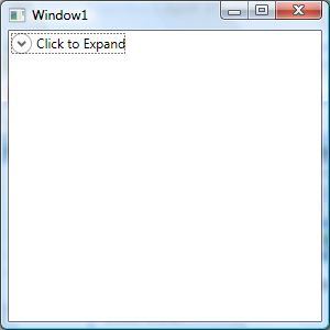
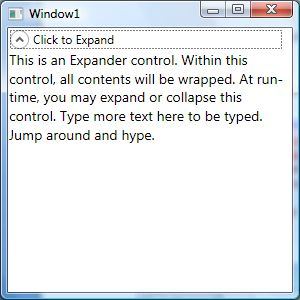
The default view of an Expander control looks like this.


If you click on the header, the expanded view looks like this.


Most of the time, you would want the header of the Expander control to look different from the contents. This can be done by simply setting the font properties of the Expander control different from the contents.
 

This code sets the FontSize and FontWeight of the Expander control different from the contents of the Expander control. 

<Window x:Class="ExpanderControlSample.Window1"  
        xmlns="http://schemas.microsoft.com/winfx/2006/xaml/presentation"  
        xmlns:x="http://schemas.microsoft.com/winfx/2006/xaml"  
        Title="Window1" Height="300" Width="300">  
    <Grid>  
        <Expander Name="ExpanderControl" Background="LavenderBlush"   
          HorizontalAlignment="Left" Header="Click to Expand"   
          ExpandDirection="Down" IsExpanded="False" Width="200"  
                  FontSize="20" FontWeight="Bold" Foreground="Green">  
            <TextBlock TextWrapping="Wrap" >  
                This is an Expander control. Within this control, all contents will be wrapped.  
                At run-time, you may expand or collapse this control. Type more text here to be typed.  
                Jump around and hype.   
            </TextBlock>  
        </Expander>  
    </Grid>  
</Window> 

The new output looks like this. As you can see from this figure, the header of the Expander control is different from the contents.


How to create an Expander control dynamically

The Expander class in WPF represents an Expander control.

This code snippet creates an Expander control at run-time.

private void CreateDynamicExpander()  
{  
   Expander dynamicExpander = new Expander();  
   dynamicExpander.Header = "Dynamic Expander";  
   dynamicExpander.HorizontalAlignment = HorizontalAlignment.Left;  
   dynamicExpander.Background = new SolidColorBrush(Colors.Lavender);  
   dynamicExpander.Width = 250;  
   dynamicExpander.IsExpanded = false;  
   dynamicExpander.Content = "This is a dynamic expander";  
  
   RootGrid.Children.Add(dynamicExpander);  

How to set the direction of an Expander Control
 

The ExpandDirection property of the Expander control sets the direction of the Header. It can be Up, Down, Left or Right. The following code snippet sets the ExpandDirection to Up.

<Expander Name="ExpanderControl" Background="LavenderBlush"   
          HorizontalAlignment="Left" Header="Click to Expand"   
          ExpandDirection="Up" IsExpanded="False" Width="200"  
                  FontSize="20" FontWeight="Bold" Foreground="Green">  
     <TextBlock TextWrapping="Wrap" >  
         This is an Expander control. Within this control, all contents will be wrapped.  
         At run-time, you may expand or collapse this control. Type more text here to be typed.  
         Jump around and hype.   
     </TextBlock>  
</Expander>

The control with Up direction looks like this.


How to set an image in an Expander Header

Expander.Header property may be used to style the header of an Expander control. Within the Header, you can set whatever contents you would like including an Image.
 

This code adds in image and text in the header of an Expander.

<Expander Name="ExpanderControl"   
  HorizontalAlignment="Left" Background="LavenderBlush"   
  ExpandDirection="Down"  IsExpanded="False" Width="250"  
          FontSize="20" FontWeight="Bold" Foreground="Green" >  
    <Expander.Header>  
        <BulletDecorator>  
            <BulletDecorator.Bullet>  
                <Image Width="50" Source="Flowers.jpg"/>  
            </BulletDecorator.Bullet>  
            <TextBlock Margin="20,0,0,0">Flower Header</TextBlock>  
        </BulletDecorator>  
    </Expander.Header>  
  
    <TextBlock TextWrapping="Wrap" FontSize="14" FontWeight="Light" Foreground="Black">  
        This is an Expander control. Within this control, all contents will be wrapped.  
        At run-time, you may expand or collapse this control. Type more text here to be typed.  
        Jump around and hype.   
    </TextBlock>  
</Expander>  

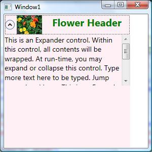
The control with an image header looks like this.


How to add scrolling to an Expander Control
 

Adding a Scrollviewer control in the contents of an Expander adds scrolling to the Expander. This code adds scrolling to the contents of an Expander. 

<Expander Name="ExpanderControl"   
  HorizontalAlignment="Left" Background="LavenderBlush"   
  ExpandDirection="Down"  IsExpanded="False" Width="250"  
          FontSize="20" FontWeight="Bold" Foreground="Green" >  
    <Expander.Header>  
        <BulletDecorator>  
            <BulletDecorator.Bullet>  
                <Image Width="50" Source="Flowers.jpg"/>  
            </BulletDecorator.Bullet>  
            <TextBlock Margin="20,0,0,0">Flower Header</TextBlock>  
        </BulletDecorator>  
    </Expander.Header>  
    <Expander.Content>  
        <ScrollViewer Height="100" VerticalAlignment="Top" >  
            <TextBlock TextWrapping="Wrap" FontSize="14" FontWeight="Light" Foreground="Black">  
                This is an Expander control. Within this control, all contents will be wrapped.  
                At run-time, you may expand or collapse this control. Type more text here to be typed.  
                Jump around and hype. This is an Expander control. Within this control, all contents will be wrapped.  
                At run-time, you may expand or collapse this control. Type more text here to be typed.  
                Jump around and hype.  
            </TextBlock>  
        </ScrollViewer>  
    </Expander.Content>  
</Expander> 

The Expander control with a scroll viewer looks like this.

READ MORE

The WPF Frame control using XAML and C# supports content navigation within content. A Frame can be hosted within a WindowNavigationWindowPageUserControl, or a FlowDocument control.

How to create a Frame in WPF

This XAML code shows how to create a Frame control and sets its Source property to load a XAML page within it.

  1. <Window x:Class="FrameSample.Window1"  
  2.     xmlns="http://schemas.microsoft.com/winfx/2006/xaml/presentation"  
  3.     xmlns:x="http://schemas.microsoft.com/winfx/2006/xaml"  
  4.     Title="Window1" Height="300" Width="300">  
  5.     <Grid>          
  6.         <TextBlock>Outside area of frame</TextBlock>  
  7.         <Frame Source="Page1.xaml">              
  8.         </Frame>  
  9.     </Grid>  
  10. </Window>  

The Window looks like this. The Purple area is the Page1.xaml and the White area is outside of the frame.


Now you can manage the contents of a frame the way you want.

For example, the following code rotates the contents of the frame to a 45 degree angle.

  1. <Frame Source="Page1.xaml">  
  2.     <Frame.LayoutTransform>  
  3.         <RotateTransform Angle="45" />  
  4.     </Frame.LayoutTransform>  
  5. </Frame>  

The new output looks like this.


How to Navigate to a URI in a WPF Frame

The following code creates a Frame within a window and adds a button control to the window. On the button click event handler we will navigate to a URI using a Frame.

  1. <Window x:Class="FrameSample.Window1"  
  2.     xmlns="http://schemas.microsoft.com/winfx/2006/xaml/presentation"  
  3.     xmlns:x="http://schemas.microsoft.com/winfx/2006/xaml"  
  4.     Title="Window1" Height="300" Width="300">  
  5.     <Grid>  
  6.         <TextBlock>Outside area of frame</TextBlock>  
  7.         <Frame Name="FrameWithinGrid" >  
  8.         </Frame>  
  9.         <Button Height="23" Margin="114,12,25,0"   
  10.                 Name="button1" VerticalAlignment="Top" Click="button1_Click">Navigate to C# Corner  
  11.         </Button>  
  12.     </Grid>  
  13. </Window>  

The Navigate method of Frame is used to navigate to a URI. The following code navigates to Page1.xaml.

  1. private void button1_Click(object sender, RoutedEventArgs e)  
  2. {  
  3.     FrameWithinGrid.Navigate(new System.Uri("Page1.xaml",  
  4.              UriKind.RelativeOrAbsolute));  
  5. }  

The following code navigates to an external website URL and opens the ASPX page within a Frame.

  1. FrameWithinGrid.Source = new Uri("http://www.c-sharpcorner.com/Default.aspx", UriKind.Absolute);  

If you need to open a URI in a new browser window, the following code will do that. This code first creates a NavigationWindow and then sets its Source to a URI.

  1. NavigationWindow window = new NavigationWindow();  
  2. Uri source = new Uri("http://www.c-sharpcorner.com/Default.aspx", UriKind.Absolute);  
  3. window.Source = source; window.Show();  
READ MORE

XAML RepeatButton in WPF

XAML RepeatButton represents a set of repeat buttons. This article shows how to use a RepeatButton control in WPF using XAML and C#. 

Creating a RepeatButton

The RepeatButton XAML element represents a WPF RepeatButton control. 

  1. <Button/>  

The Width and Height attributes represent the width and the height of a RepeatButton. The Content property sets the text of the button. The Name attribute represents the name of the control, that is a unique identifier of a control. 

The code snippet in Listing 1 creates a Button control and sets its name, height, width and content. 


<RepeatButton Margin="10,10,0,0" VerticalAlignment="Top"   
   HorizontalAlignment="Left"   
   Name="GrowButton" Width="80" Height="30">  
</RepeatButton>  

Listing 1

The default property of a button is Content. The code snippet in Listing 2 creates the same button as created by Listing 1.

<RepeatButton Margin="10,10,0,0" VerticalAlignment="Top"   
   HorizontalAlignment="Left"   
   Name="GrowButton" Width="80" Height="30">  
   Grow  
</RepeatButton>  

Listing 2

The output looks as in Figure 1


Figure 1

Delay and Interval

The Delay and Interval properties make a RepeatButton different from a normal button. 

RepeatButton is a button that fires Click events repeatedly when it is pressed and held. The rate and aspects of repeating are determined by the Delay and Interval properties that the control exposes.

The code snippet in Listing 3 sets the Delay and Interval properties. 


<RepeatButton Margin="10,10,0,0" VerticalAlignment="Top"   
   HorizontalAlignment="Left"   
   Name="GrowButton" Width="80" Height="30"   
   Delay="500" Interval="100" >  
   Grow  
</RepeatButton>  

Listing 3

Adding a Button Click Event Handler

The Click attribute of a RepeatButton element adds the click event handler and it keeps firing the event for the given Interval and delay values. The code in Listing 4 adds the click event handler for a Button. 

<Button x:Name="DrawCircleButton" Height="40" Width="120"   
        Canvas.Left="10" Canvas.Top="10"   
        Content="Draw Circle"  
        VerticalAlignment="Top"   
        HorizontalAlignment="Left">  
Click="DrawCircleButton_Click"  
</Button>  

Listing 4

The code for the click event handler looks as in following. 

  1. private void GrowButton_Click(object sender, RoutedEventArgs e)  
  2. {  
  3. }  

Okay, now let's write a useful application. 

We will build an application with the two buttons Grow and Shrink and a rectangle. The application looks as in Figure 2.

When you click and continue pressing the Grow button, the width of the rectangle will continue to grow and when you click on the Shrink button, the width of the rectangle will shrink continuously. 


Figure 2

The final XAML code is listed in Listing 5

<Window x:Class="RepeatButtonSample.Window1"  
    xmlns="http://schemas.microsoft.com/winfx/2006/xaml/presentation"  
    xmlns:x="http://schemas.microsoft.com/winfx/2006/xaml"  
    Title="Window1" Height="300" Width="300">  
      
    <Grid Name="LayoutRoot">  
        <RepeatButton Margin="10,10,0,0" VerticalAlignment="Top"   
                      HorizontalAlignment="Left"                         
                      Name="GrowButton"  Width="80" Height="30"   
                      Delay="500" Interval="100"   
                      Click="GrowButton_Click">  
            Grow  
        </RepeatButton>  
        <RepeatButton Margin="100,10,0,0" VerticalAlignment="Top"   
                      HorizontalAlignment="Left"                         
                      Name="ShrinkButton"  Width="80" Height="30"   
                      Delay="500" Interval="100"   
                      Click="ShrinkButton_Click">  
            Shrink  
        </RepeatButton>  
          
        <Rectangle Name="Rect" Height="100" Width="100" Fill="Orange"/>  
  
    </Grid>  
</Window>  

Listing 5

Listing 6
 is the click event handlers for the buttons that change the width of the rectangle.

private void GrowButton_Click(object sender, RoutedEventArgs e)  
{  
    Rect.Width += 10;  
}  
  
private void ShrinkButton_Click(object sender, RoutedEventArgs e)  
{  
   

Listing 6

READ MORE

In this article, we'll be discussing why text is sometimes rendered more blurry with WPF, how this was later fixed and how you can control text rendering yourself.

As already mentioned in this tutorial, WPF does a lot more things on its own when compared to other UI frameworks like WinForms, which will use the Windows API for many, many things. This is also clear when it comes to the rendering of text - WinForms uses the GDI API from Windows, while WPF has its own text rendering implementation, to better support animations as well as the device independent nature of WPF.

Unfortunately, this led to text being rendered a bit blurry, especially in small font sizes. This was a rather big problem for WPF programmers for some time, but luckily, Microsoft made a lot of improvements in the WPF text rendering engine in .NET framework version 4.0. This means that if you're using this version or higher, your text should be almost as good as pixel perfect.

Controlling text rendering

With .NET framework 4.0, Microsoft also decided to give more control of text rendering to the programmer, by introducing theTextOptions class with the TextFormattingMode and TextRenderingMode properties. This allows you to specifically decide how text should be formatted and rendered on a control level. This is probably best illustrated with an example, so have a look at the code and the screenshots below to see how you can affect text rendering with these properties.

TextFormattingMode

Using the TextFormattingMode property, you get to decide which algorithm should be used when formatting the text. You can choose between Ideal (the default value) and Display. You would normally want to leave this property untouched, since the Ideal setting will be best for most situations, but in cases where you need to render very small text, the Display setting can sometimes yield a better result. Here's an example where you can see the difference (although it's very subtle):

<Window x:Class="WpfTutorialSamples.Control_concepts.TextFormattingModeSample"
        xmlns="http://schemas.microsoft.com/winfx/2006/xaml/presentation"
        xmlns:x="http://schemas.microsoft.com/winfx/2006/xaml"
        Title="TextFormattingModeSample" Height="200" Width="400">
    <StackPanel Margin="10">
        <Label TextOptions.TextFormattingMode="Ideal" FontSize="9">TextFormattingMode.Ideal, small text</Label>
        <Label TextOptions.TextFormattingMode="Display" FontSize="9">TextFormattingMode.Display, small text</Label>
        <Label TextOptions.TextFormattingMode="Ideal" FontSize="20">TextFormattingMode.Ideal, large text</Label>
        <Label TextOptions.TextFormattingMode="Display" FontSize="20">TextFormattingMode.Display, large text</Label>
    </StackPanel>
</Window>

Using the TextFormattingMode property

TextRenderingMode

The TextRenderingMode property gives you control of which antialiasing algorithm is used when rendering text. It has the biggest effect in combination with the Display setting for the TextFormattingMode property, which we'll use in this example to illustrate the differences:

<Window x:Class="WpfTutorialSamples.Control_concepts.TextRenderingModeSample"
        xmlns="http://schemas.microsoft.com/winfx/2006/xaml/presentation"
        xmlns:x="http://schemas.microsoft.com/winfx/2006/xaml"
        Title="TextRenderingModeSample" Height="300" Width="400">
    <StackPanel Margin="10" TextOptions.TextFormattingMode="Display">
        <Label TextOptions.TextRenderingMode="Auto" FontSize="9">TextRenderingMode.Auto, small text</Label>
        <Label TextOptions.TextRenderingMode="Aliased" FontSize="9">TextRenderingMode.Aliased, small text</Label>
        <Label TextOptions.TextRenderingMode="ClearType" FontSize="9">TextRenderingMode.ClearType, small text</Label>
        <Label TextOptions.TextRenderingMode="Grayscale" FontSize="9">TextRenderingMode.Grayscale, small text</Label>
        <Label TextOptions.TextRenderingMode="Auto" FontSize="18">TextRenderingMode.Auto, large text</Label>
        <Label TextOptions.TextRenderingMode="Aliased" FontSize="18">TextRenderingMode.Aliased, large text</Label>
        <Label TextOptions.TextRenderingMode="ClearType" FontSize="18">TextRenderingMode.ClearType, large text</Label>
        <Label TextOptions.TextRenderingMode="Grayscale" FontSize="18">TextRenderingMode.Grayscale, large text</Label>
    </StackPanel>
</Window>

Using the TextRenderingMode property

As you can see, the resulting text differs quite a bit in how it looks and once again, you should mainly change this in special circumstances.

READ MORE

Windows Presentation Foundation (WPF) resources provide a simple way to reuse commonly defined objects and values. Resources in WPF allow you to set the properties of multiple controls at a time. For example you can set the background property on several elements in a WPF application using a single resource.

The best way of defining the resources is on a Window or Page element level. Any resource that you define for an element also applies to their child elements of that element. For example if you define a resource for a Window element that has a Grid as a child element, then the resources defined for the window elements can also be used by the grid element. However, if you define a resource for the grid element, then the resource applies only to the child elements of the grid element.

Syntax for resources in WPF as follows

<elementName propertyName="{markupExtension keyName}">

<!-Content -->

</elementName>

elementName: Name of the element that uses the resource

propertyName: Name of the property that takes its value from the resource

markupExtension: Define type of resource

keyName: key name of the resource, which is unique string to identify the resource

There are two types of resource, namely

  • Static Resource
  • Dynamic Resource


Let's see basics of both resources

Static Resource

We should use the StaticResource markup extension to define the resource as a static resource. The value of StaticResource is determined at the time of loading.

Let's have a sample program, Add the below code snippet in Window1.xaml file inside the Grid

<Grid.Resources>

            <SolidColorBrush x:Key="lblbgcolor" Color="Blue"/>

        </Grid.Resources>

        <Label Name="lbl" Margin="71,44,77,0" Background="{StaticResourcelblbgcolor}" Height="49" />

Above code, Grid control uses the Resources property (<Grid.Resources>) to define resource. SolidColorBrush resource named lblbgcolor defined. lblbgcolor resource is used to set the background property of lable.

Dynamic Resource

Dynamic Resource we use in a situation where we want to change the value of property at run time.

Let's have a sample program, Add the below code snippet in Window1.xaml file inside the Window element

<Window.Resources>

        <SolidColorBrush x:Key="brush" Color="Red" />

    </Window.Resources>

    <Button x:Name="btn" Content="Click Me" Click="Button_Click" Background="{DynamicResource brush}" Height="100" Width="100" />

Open Code behind and add the following code snippet

private void Button_Click(object sender, RoutedEventArgs e)

{

    this.btn.SetResourceReference(BackgroundProperty, "brush");

}

Above code, Window control uses the Resources property (<Window.Resources>) to define resource. SolidColorBrush resource named brush defined. brush resource is used to set the background property of button.

READ MORE
...